
Any industry or business that doesn’t pay attention to the latest millennial spending and purchasing habits is doing themselves a big disservice (well, maybe that’s not entirely true; AARP, we’ll let you off the hook on this one). That’s because, as of 2020, millennials account for a quarter of the US population, making them the largest living generation…and most markets’ primary target customers. In fact, relevant to the wedding industry, in particular, millennials make up 80% of today’s marrying couples – 80%!
You’ll know a little bit about this if you’ve already read our blog post, How Millennials Shop for Wedding Venues, which provides a leg up on millennial buying habits in general, but also how they translate to the ways they shop around for venues. In short, millennials are a generation that doesn’t cold call or just show up to a place to get information. They do their research before making contact – and they do it well. Think Instagram as a way to scope out venues and customer reviews on The Knot as their preferred source of endorsements.
For that reason, maintaining a presence across multiple platforms (digital and print) is valuable to get your venue in front of this large demographic. But in order to finally connect and convert, the tool that especially needs to be tailored to this generation’s preferred way to consume information? Your wedding venue website design. Here are the golden rules venues should follow if looking to sync their website to the tune of millennials’ buying patterns, plus the best wedding venue website design examples from our clients.
Highly Visual with Quality Photography/Videography
Imagery is everything to this generation. And when it comes to the venue search, photography is an essential part (case in point: Wedding Spot reports that 86% of users who visit a venue profile on their site also browse the venue’s photos). Therefore, your website must showcase high-quality, authentic-feeling (not stock) images – and a lot of them. Luckily, you’ve likely got access to preferred photographer vendors who have shot weddings at your property, which means they’re apt to provide imagery in exchange for promotion or a negotiated fee.
Example: Red Ridge Receptions
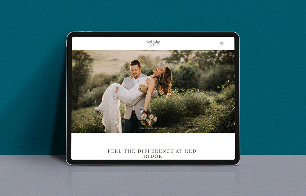
A large carousel gallery of stunning imagery commands the presence of this website’s landing page. And not just any old imagery. We’re talking thoughtfully curated images from past weddings held at this rustic and hidden gem of a venue just outside Austin, Texas, that evoke the experience and subsequent sense of “I want that” from prospective couples.
Market Your Once-in-a-Lifetime Moments
Millennials prefer to spend their money on experiences over material goods. Yes, that can be captured through the use of your website’s once-in-a-lifetime, experience-evoking imagery. But it can also be translated through your website copy. Personal testimonials from previous client couples, as well as “real wedding” stories, help capture weddings as once-in-a-lifetime experiences. And the place to truly celebrate right? Why, your venue of course.
Example: The Vine
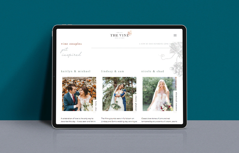
Located on this venue’s website landing page, about halfway down, is a collection of image tiles depicting real couples who held their wedding at this premier wedding property near Austin and Houston, Texas. Based on the style of wedding that strikes someone’s fancy – boho chic, Southern elegance, or classic glamour, to name a few – users can click on the couple (i.e. “Kaitlyn & Michael”) and be taken to a page that tells the experience of their wedding in copy, testimonials, and imagery.
Be Transparent with Packages, Pricing, Services, and So On
As we stated, millennials do their due diligence in terms of research before picking up a phone or opening an email. This means they are going to gather up as much info as they can about a venue in terms of pricing, packages, services, and more. We’re not saying this information should be front and center on your landing page, but don’t bury it (we suggest including it in the top nav). It’s important to let them know early on what you can and can’t offer them to save them, as well as your sales reps, time.
Example: Christmas House Inn & Gardens
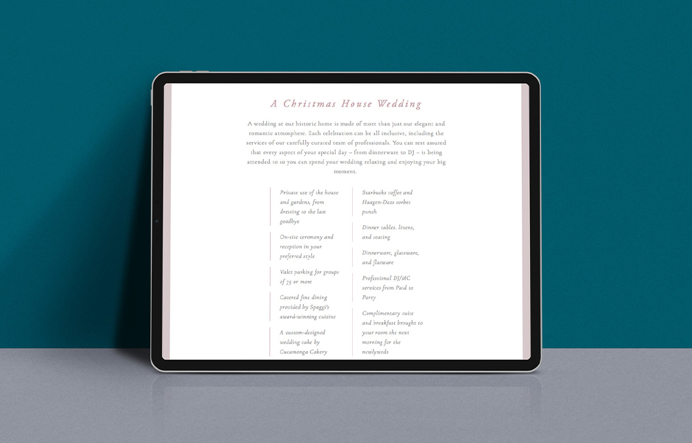
This romantic garden venue, located in Southern California, smartly includes a bulleted list of common details that prospects want to know about the property halfway down its weddings landing page. For example, info about the use of the house and gardens, valet parking, catering, etc. Equally valuable, the navigation bar includes a drop-down menu that clicks to separate pages about the event spaces, after-parties, and pricing.
Position Yourself as a Resource They Need
You know weddings, and you know the latest trends. Leverage that by starting (or regularly updating) your website’s blog with informative content, like “5 Examples of Non-Traditional Bouquets.” The more you can establish yourself as an expert resource, the more couples will trust you – making the sell easier.
Example: Longwood Venues & Destinations
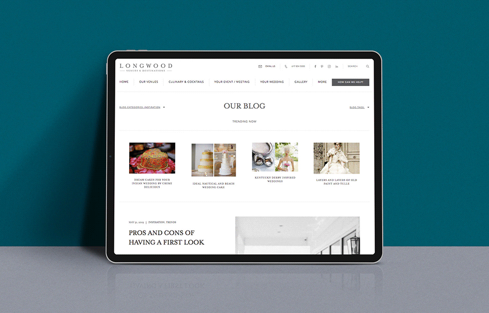
This collection of five wedding and event properties, scattered across the states of Massachusetts and Rhode Island, features a regularly updated wedding blog, delivering content related to wedding inspiration, trends, culinary arts, and more. Take, for example, “The Pros & Cons of Having a First Look.”
Other Website Cues Millennials Eat Up
Inclusive Terminology: It’s 2020 and love is love, no matter how couples identify. To prevent alienating potential clients, avoid the outdated term of just “bride and groom” or “husband and wife” in your language. Rather, use references such as “bride OR groom,” “couples,” “partners,” or “newlyweds.”
A Clear CTA Across Every Page: Your first and foremost reason for even having a website? To start a convo between you and your potential clients. But users don’t always enter your website through your landing page – often they are accessing other pages first (blog, galleries, other). So be sure the “Contact Us” call-to-action lives on every page (we suggest in the top nav, where it’s consistently positioned and not too “in your face”).
A Short & Sweet Contact Form: You may have heard that millennials have a short attention span (no, you don’t say?). If your contact form is too long and asks too much of a prospect, they won’t complete it. And despite what some people think, millennials are generally protective of the info they give out. In addition to keeping required fields to four or fewer on a form, create a dropdown that asks how they prefer to be contacted (email, phone, text, other) and let them decide how they want to connect.
Does all this sound great, but you’re not sure how to put it into action?
Our team of designers, writers, and strategists are at your digital disposal. Just drop us a line any time.