A wedding venue’s website is the initial opportunity to paint a picture of a perfect backdrop for someone’s special day. You could have the most elegant venue, with the most enticing all-inclusive wedding packages, but if your website is lackluster, few couples will ever step foot on your property for a tour. Because without an appealing website, it is virtually impossible to garner the attention of engaged couples. In an age of saturation of wedding websites on the internet, standing out, landing tours, and booking dates is no easy task. Here, we’re highlighting what four top wedding venue websites are getting right – as well as our take on what else they could do to really hit it out of the park.
The Farm
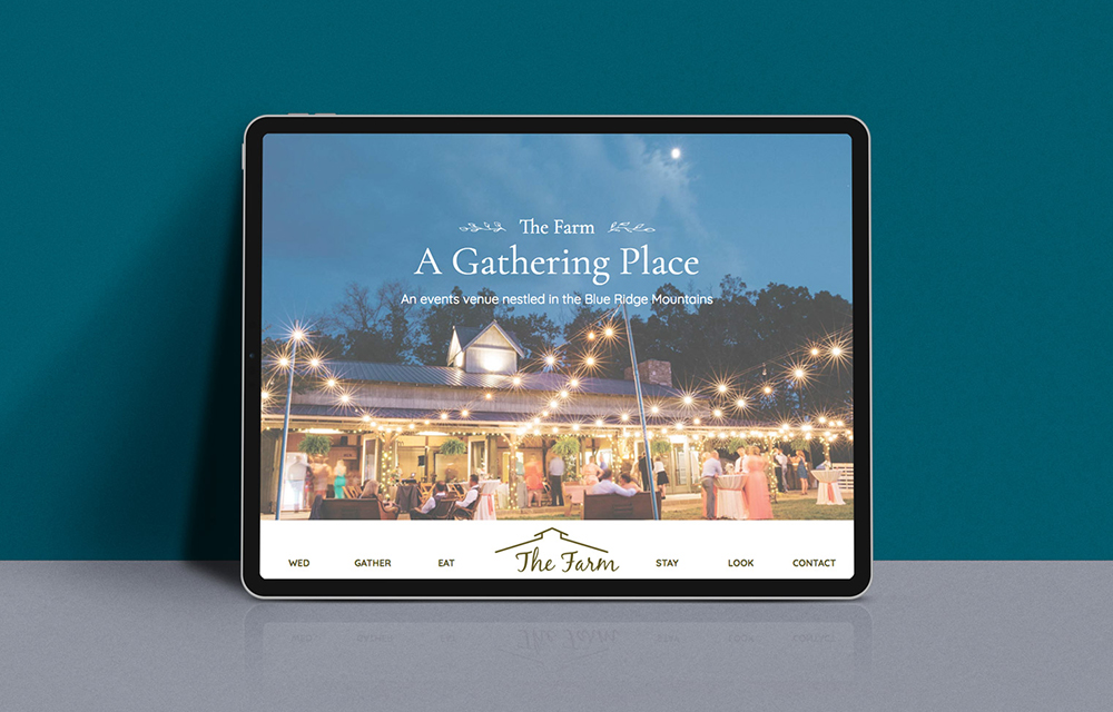
What’s working: A website design that reflects the vibe of a wedding venue is an element that will drive more qualified leads to reach out about a date or a property tour. The Farm lets their imagery do the talking when it comes to conveying their use of nature to set the scene for their weddings. From photos of their rustic decor and spaces to illustrations used to accent the text elements on the website – like acorns, branches, and wheat stalks. Browsing this website, a visitor could easily assess whether the venue fits their style and needs, no reading required.
What could be better: Site speed. A beautifully designed website is no match for the short attention span of most consumers. Clicking from page to page on this website is a bit of a hassle and interferes with the flow of exploring all the available options The Farm offers. According to Forbes, just shy of 50% of users will click off your website if it doesn’t load in 3 seconds or less. Beware of slow loading times — and remember there are plenty of site speed tests you can run to verify loading times for your website.
Christmas House Inn & Gardens
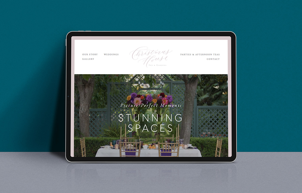
What’s working: Website copy is often overlooked, but is a critical website element. Christmas House does a great job of weaving in colorful details that leave the reader with a clear image in their mind. Flowery language, however, is not the end-all-be-all of great web copy, especially for wedding websites; there has to be a balance between pretty prose and essential details like pricing, package specifics, and other amenities that set your venue apart. Christmas House effectively strikes that balance, leaving couples excited and informed.
What could be better: While they include beautiful imagery on each webpage, and a gallery chock-full of happy memories and property highlights, Christmas House is missing one important visual element: video. Whether we’re talking new-age virtual reality (VR) or tried-and-true video footage of your venue and actual weddings, video is becoming an integral part of venues’ digital marketing efforts.
SOLUTIONS
Is Your Website Primed to Capture Couples?
Even in the face of a pandemic, couples are still finding ways to get married. So don’t lose business to a courthouse or virtual wedding.
The Park Savoy Estate
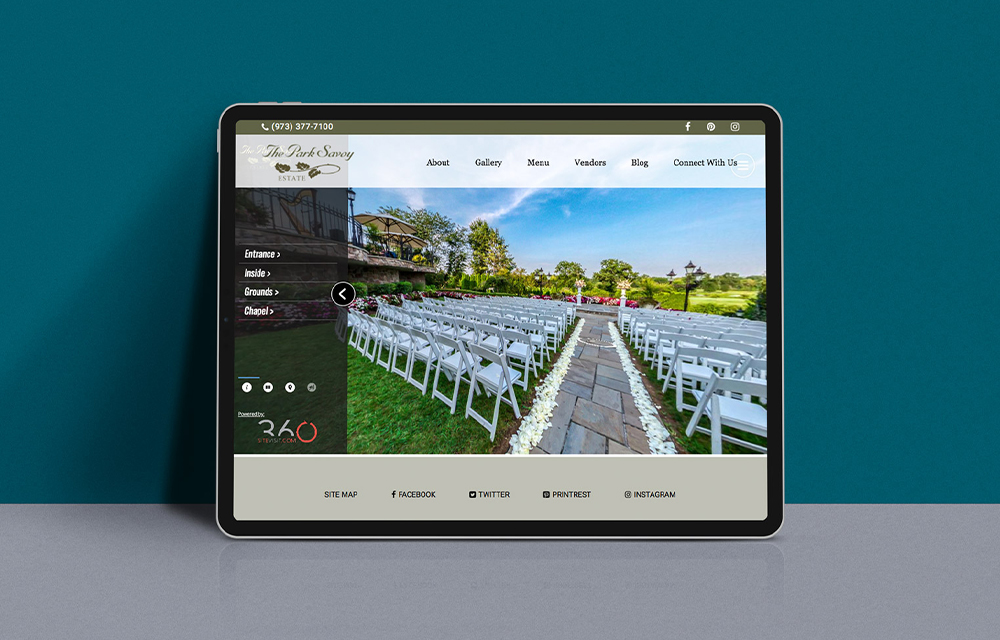
What’s working: Speaking of VR, The Park Savoy offers website visitors a complete virtual tour of their facilities and property. Web visitors can show themselves around this historic estate in addition to reading through their services and well-maintained blog. A VR tour is an engaging, valuable tool for brides-and-grooms-to-be to get a real sense of the special character of a venue.
What could be better: Where are the services? Park Savoy’s services are not only hidden within a subsection of a larger tab (services is a big one and should always have its own tab) but once you find them, they’re presented in a giant block of text the reader needs to comb through. Always remember to give the people what they want, and do it fast. A wedding venue website should make their list of services easy to find and easily scannable – making people work for it is not a recipe for conversion.
Basin Harbor
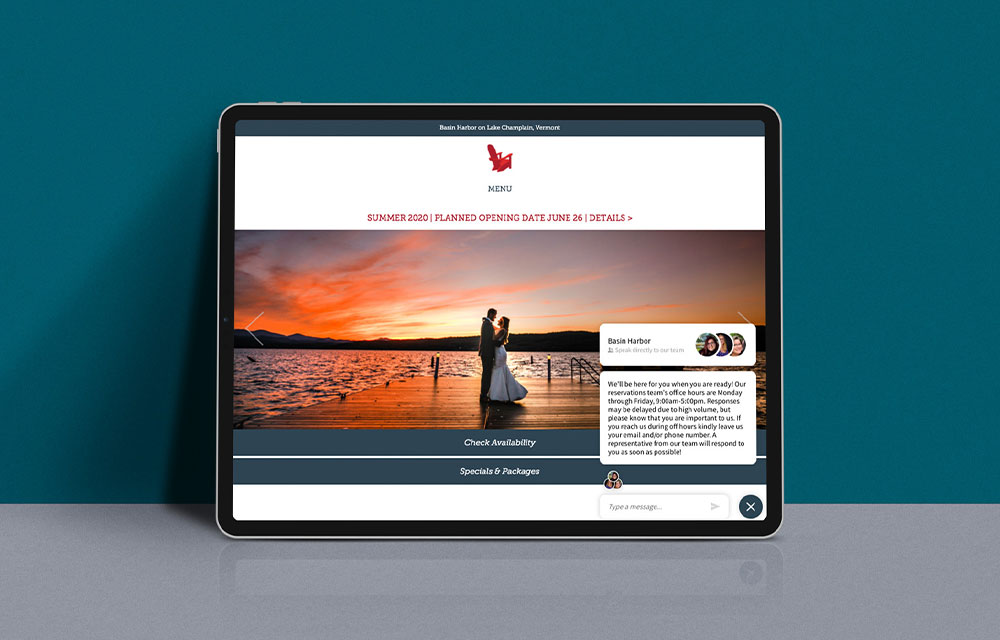
What’s working: According to Hubspot, 82% of customers value a timely response to inquiries. Basin Harbor website’s live chat feature is a very valuable asset that most wedding websites are lacking. Website visitors can instant message with a Basin Harbor team member as they browse the website, quickly getting answers to their questions. The live chat also provides Basin Harbor with an opportunity to invite curious browsers to an on-site visit.
What could be better: The wedding page is only one part of the greater Basin Harbor website, and weddings take a back seat to all the venue’s other offerings on the home page. Bringing weddings more to the forefront would help increase awareness of all the venue has to offer prospective brides and grooms.
Related Reading
This blog post is part of our series on how to build powerful wedding & event venue websites. Be sure to check out the other posts, including a 6-minute video with our CEO, Jess Kaiser:


