We tapped some of our hospitality marketing agency’s brightest design minds – professionals tasked with reimagining client websites every day – to share some of their website design inspiration. These websites, varying in complexity, style, and industry, stood out to our designers and will influence their work moving forward. Here’s why.
An Airline’s Engaging Digital Magazine
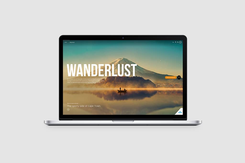
The Website: IFly Magazine
Designer’s Take: “This is a digital magazine produced by KLM Airlines. It’s amazingly visual. They mix static images with video, music, and brilliant typography. They’re really smart about their image choices in this particular case, bringing this idea of “wanderlust” to life.”
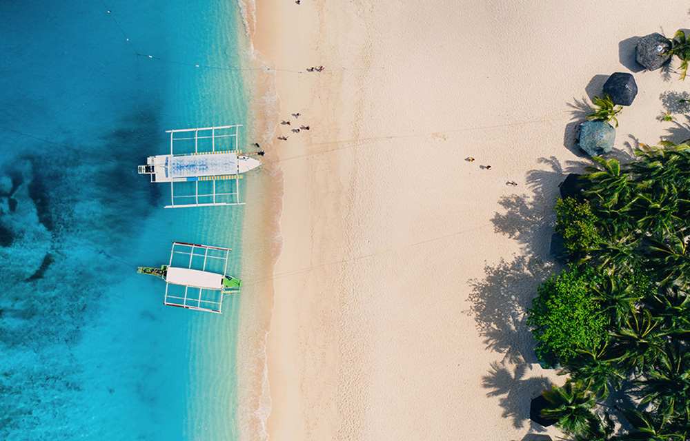
Reach More Clients with Experiential, Destination-Driven Content
Minimalism and White Space on This Resort’s Website
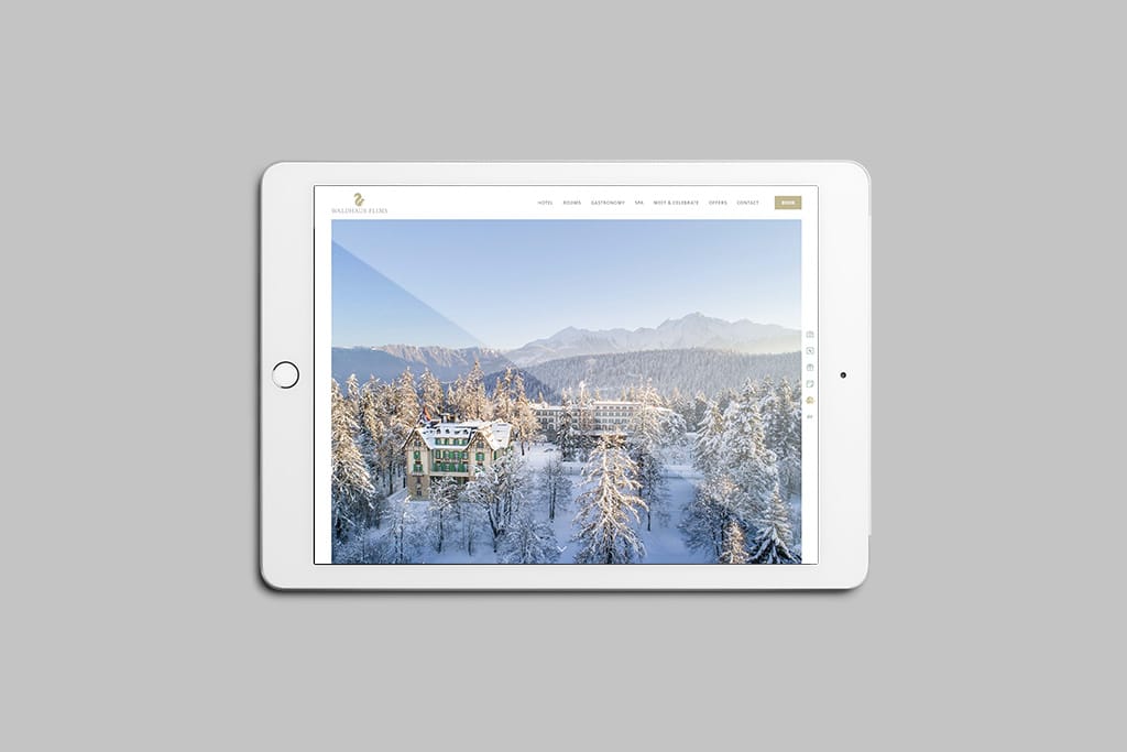
The Website: Waldhaus Flims
Designer’s Take: “I just love how elegant the website for Waldhaus Flims, a hotel in Switzerland, looks. The white space, the minimalist design – so well done. You don’t usually see a hotel website design like this. The images really shine here, and I think that’s the key for a beautiful hotel like this. I also think it’s important to note that this hotel is getting their message and brand across without too much text. There’s a sweet spot where you communicate enough, but you don’t crowd the key part of your message.”
A Luxury Condo Complex Playing with Asymmetrical, Overlapping Images
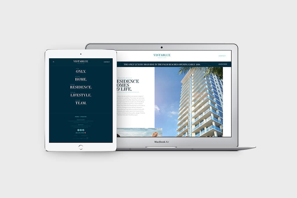
The Website: VistaBlue Singer Island
Designer’s Take: “This website plays with an asymmetrical concept by having the images overlap and not aligning them to a centerfold. It breaks the mold of what we’ve come to expect from websites and does a really great job grabbing your attention, especially because hospitality website design tends to be more on the conservative side. I also love the subtle animations and vector illustrations that appear throughout. Finally, I especially like the navigation. When you click the hamburger menu, the menu opens full-page and turns blue. Then, the little wavy lines animate under the navigation items and display the sub-navigation. You don’t see something like this very often.”
How These Websites Finally Made Waves for this Maine-Based Boutique Hotel Collection
A Mix of Engaging Homepage Content and Features for This Restaurant
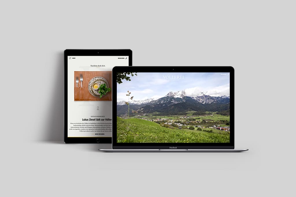
The Website: Vollerei
Designer’s Take: “Vollerei’s website starts with a video that tells a story and engages you right away. Then, when you scroll down, you come across a bunch of images that you can interact with. You scroll and a drink spins, a table set opens, etc. They’re clean in their design approach, but there’s plenty of stimulation to keep you interested.”
A Restaurant Company’s Playful Single-Page Website That Keeps You Clicking
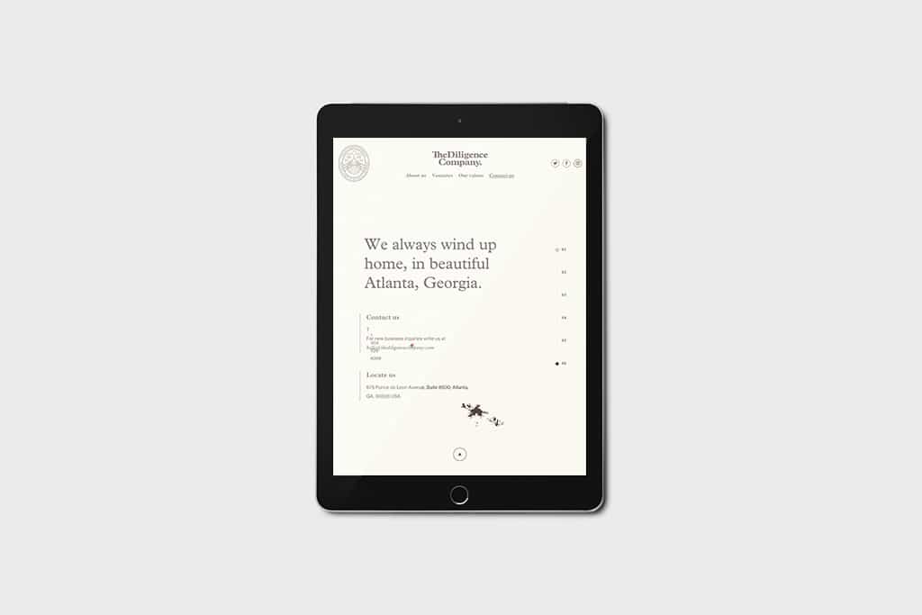
The Website: The Diligence Company
Designer’s Take: “The Diligence Company makes me actually read the content on their website because the typography is so good and the page is fun to navigate. I love how, when you scroll, you see your progress on the page – it’s a lot of content, but because you see your progress so clearly, you don’t feel overwhelmed. On other websites that rely on scrolling, it can feel never-ending, so it’s nice that they show you a clear progress bar on the right side of the page, and underline the section that you’re currently on at the top.”