There are two types of UX trends: those that become popular because they provide some sort of artistic flourish, and those that are aesthetically sound but also accomplish a specific business goal. Here are three UX design trends on our radar that hotels looking for a new website or design overhaul should consider exploring.
Cinemagraphs: Not a Photo, Not Quite a Video
Cinemagraphs (still photographs in which a minor and repeated movement occurs) are still novel enough to capture the attention of browsing visitors. As a blend between video and a still photo, there’s a depth that isn’t present in other image formats, and they’re able to bring an environment alive in a new way. Websites that use video as a background image risk making their visitors dizzy and distracted. The minimal movement of cinemagraphs, on the other hand, stir the desired ambiance without bothering the viewer.
Examples
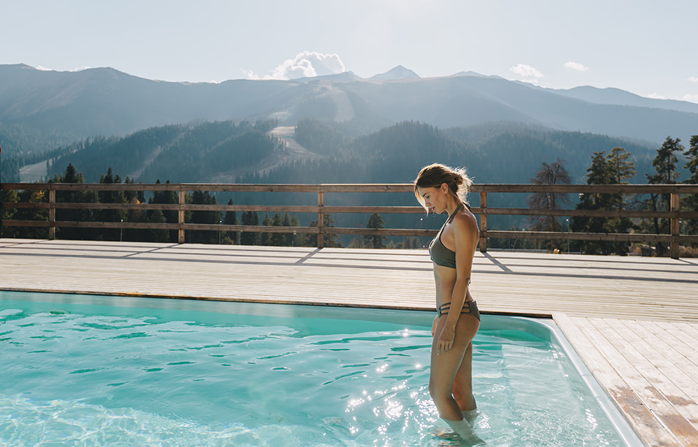
- Olympus Villas uses a cinemagraph to show the pool water moving to draw you in.
- Meet the Greek Restaurant uses minimal motion video to captivate the viewer and give you a glimpse of an authentic Greek moment.
New Approaches to Your “Book Now” CTA
Every hotel marketing team understands the vital power and importance of the “Book Now” button, to give visitors that easy purchase decision – but the placement and execution of the button matters. The CTA must be above the fold. If users must scroll to get there, there’s a good chance that it’s simply not getting seen. Likewise, some of the most effective CTAs today are ones that respond with a mouseover – no need to load a new page. When it comes to hotel marketing, the less friction, the better the conversion rate.
Examples
- The Goodwin Hotel features a bright “Book Now” button that instantly opens a booking widget when you mouseover.
- Babington House has their booking CTA in two places: the icon in the upper left corner and a widget underneath the hero image.
- Bosehof may do it best: They have a CTA button stickied to the bottom middle of the screen, so as users scroll, it stays with them, ready for action.
Let Them Scroll
Scrolling, when done right, gives visitors just enough content to satiate their curiosity but not so much that they feel overloaded. In the age of social feeds and the continued shift to mobile, scrolling is the natural state of browsing and allows hospitality websites the space to highlight different facets of their business, like restaurants, reward programs, guest testimonials, season packages, and more. Like video, scrolling is best used in moderation, though. Never-ending scrolling can be just as ineffective as having too little. Ideally, visitors will be able to consume your homepage in 15 seconds or less.
Examples
- Villiers London has a highly visual, readable website that draws you in and drives you to their content.
- Five Seas Hotel’s website uses a tile-style arrangement of images, another website trend we’ve had our eye on, to introduce visitors to the area, then the suites, and finally, a CTA to sign up for the newsletter.


