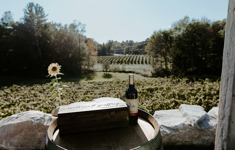
LaBelle Winery may have started in the backyard barn on the owner’s residential property back in 2008. But, much like a fast-growing grapevine, the operation has remarkably outgrown those meager beginnings. Moving into their 11-acre Amherst, New Hampshire, headquarters in 2012, the boutique winery now boasts more than just award-winning red and white blends made from hearty grapes grown on-site, but an entire brand. We’re talking a farm-to-table bistro, culinary line and market, cooking classes, art gallery, and one of the most beautiful settings for weddings and events in the Granite State. The growth didn’t stop there either: In addition to acquiring their Portsmouth-based tasting room and store in 2017, they also opened a third location in Derry in 2021, home to another market, restaurant, winemaking facility, tasting barn, and a nine-hole, par-3 golf course.
So you could imagine the surprise when a visit to their winery website didn’t exude the same level of quality that exists in all their stunning facilities and operations. In fact, instead of growing with the brand as it evolved into this leading New England food and beverage experience, the website felt a bit like it was stuck – back in the days of 2008 when the brand was still working out of a barn. And not only did they have just one dated site, but three: one dedicated to the wine brand, one to the restaurant bistro, and one to the event and catering side of the operations. Here’s a look at how Hawthorn Creative, a full-service marketing agency specializing in website design, built a new site that brought all aspects of the brand under one umbrella while staying true to the principles of good website design.
>> DOWNLOAD OUR FREE E-BOOK: 6 Essential Questions to Vet a Website Design Agency <<
The Old Website Design
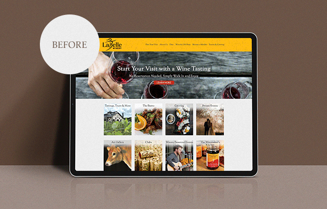
In short: The websites felt a little dated with not a lot of customization. A bright yellow header (the brand’s color) and footer took attention away from the content, which, in some places – like the “Our Story” page – was also excessively heavy, causing the reader to become unfocused and abandon the page. And while the sites did feature images, there was little use of hero images – big eye-catching images that, in good website design, are usually seen in the above-the-fold zone of the webpage to capture the user’s attention and compel them to want to click around. Rather, they were small and resembled thumbnails, with placement and size that felt like an afterthought.
The New Custom Website Design: Starting with the Navigation & User Journey
Yes, multiple sites can be beneficial, especially for companies made up of multiple brands or offering different products to wildly different customer bases. But since LaBelle is one brand with the same target audience across their offerings, they really didn’t require all the different domains. And by bringing their entire brand under one umbrella site, it would surely help their SEO. The challenge was determining how we were going to incorporate all elements of the three sites into one that was also easy to navigate and intuitive to users.
That meant looking closely at how we were going to organize the navigation by pages. Here’s what we landed on:
- “About”
- “Experience LaBelle” – Outlining the different winery locations.
- “Wedding & Events”
- “Public Events” – The brand’s event calendar and upcoming cooking classes.
- “The Winemaker’s Kitchen” – The brand’s culinary line.
- “Shop” – The e-commerce portion of the site, where people could actually buy the wine and culinary products online.
- “Contact”
We then used a mega menu – a type of expandable menu in which multiple choices are displayed when you hover over a certain label. This helped to accommodate a large number of options and for revealing lower-level site pages at a glance.
A Few Other Examples of How We Did It: The Elements of Good Website Design
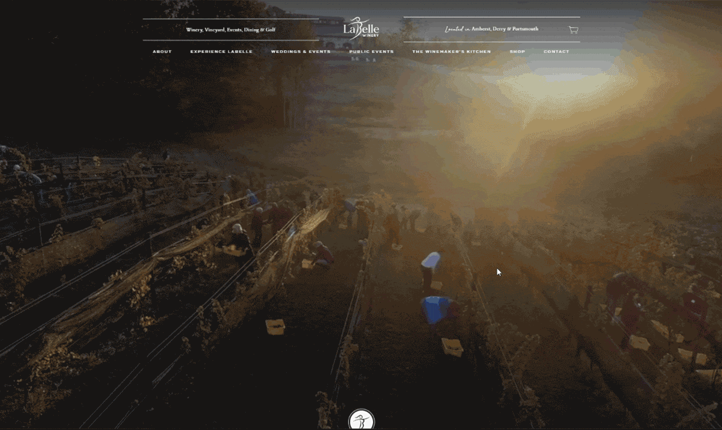
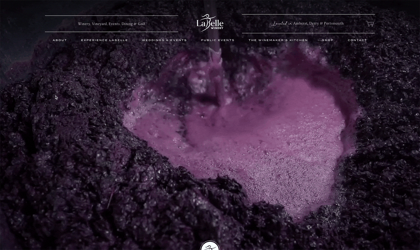
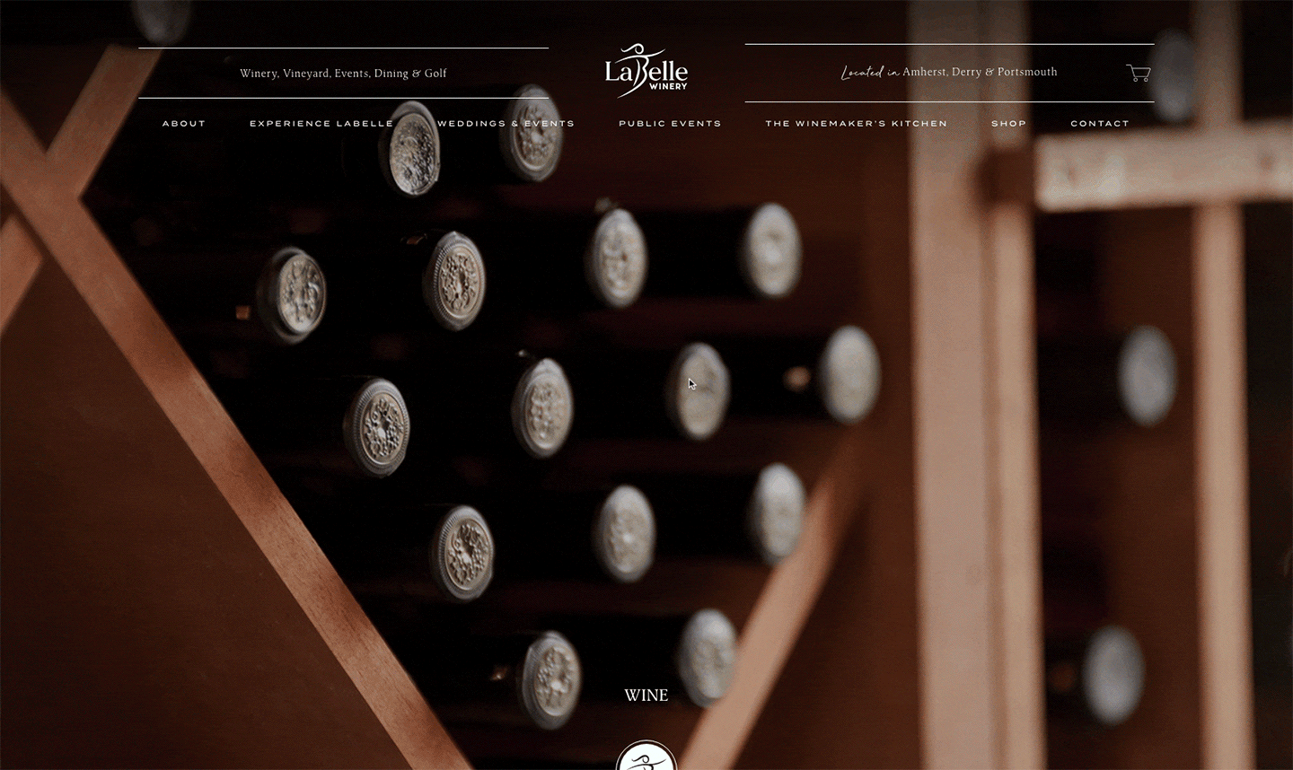
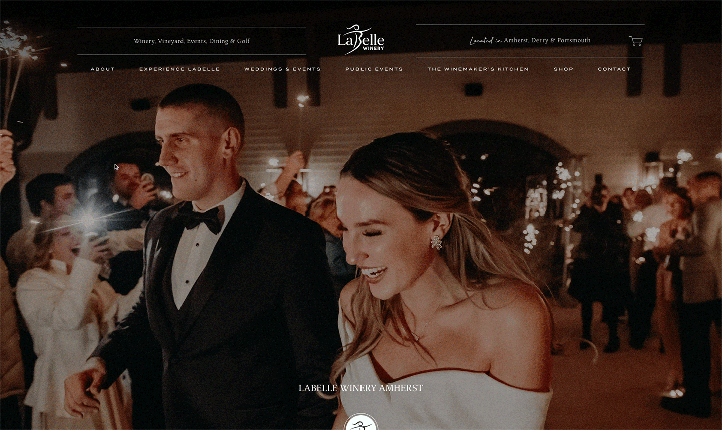
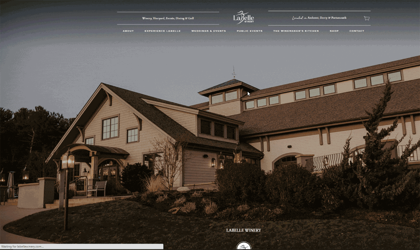
Splashy Show-Stopping Visuals
When it comes to websites, images serve as both eye candy and informational tools – helping to increase time on site by capturing the attention of the visitor and causing them to linger longer, as well as conveying messages without lengthy copy.
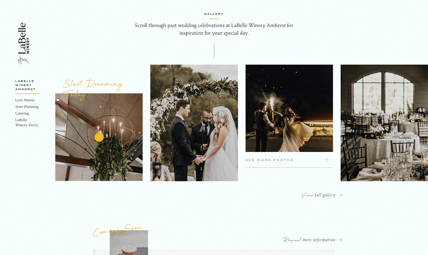
In the case of LaBelle Winery, they came with a library of roughly 20 strong images, which we planned to use large to draw people into the winery and brand experience, unlike their previous website’s “thumbnail-image” approach. And to better round out that collection and what we were working with, our agency also reached out to local photographers who had shot weddings and events at the venue to source additional images – not just for the wedding and events pages of the website, but just any general vineyard or property photography that we could use on other pages of the site. Showing diversity and inclusivity was also at the forefront of our image selection, something that is expected in this day and age.
Animation & Movement
Animating elements of a website offers designers and developers a powerful tool for increasing engagement. Sure, it generally looks cool, but it also makes your website feel more responsive and intuitive to your users. However, there is such a thing as too much movement or animation, resulting in confusion or distraction.
With so much content that was going to live on LaBelle’s website, we wanted to use animation not just because it’s en vogue, but as a way to guide users through the pages. Images and text appear to fade into the page, blocks slide in from offscreen, images move slightly when hovered over, buttons morph in response to clicks. The key is that it’s all done in a subtle and intentional way to help move the users along through the site. One of our favorite features is how when you load a new page, the logo set below the hero image bounces ever so slightly so that you feel compelled to scroll down and follow it.
Updated Color Palette that is WCAG Level-A Compliant
Never underestimate the power of color in website design. Color increases brand recognition, attracts attention to important website elements, and can even stir emotions within the users.
The issue with LaBelle Winery’s old site is that it didn’t really have a color palette: just their main LaBelle yellow and then a bold black. In fact, as we were designing the new site, we found that the particular yellow often failed to pass WCAG compliance when used as a hover feature. So, while we made sure to work in that Labelle yellow in various places, we also built out a palette of complementing colors in shades of taupe and grey that did pass contrast standards.
Integration of Other Parts of the Website through Card-Based Design
Popularized by the image-sharing site, Pinterest, card-based web design has been steadily growing in popularity over the past few years. In LaBelle’s website, we use a series of image cards – an image plus basic information, such as a title, contained in a block, a.k.a. “card” – at the top and bottom of main landing pages to help guide users into the natural next step of the buyer journey.
For example, when you load the About page, the image cards slide in below the header, offering up links to other pages that a user might naturally take the next step to, such as “Our Wine Collection,” “Tasting & Tours,” “Weddings & Events,” “Becoming A Member” and “Products & Gifts.” So users are not just hearing the story of how the winery began, they are then being chauffeured to additional core pages on the website to streamline their journey to conversion.
Sidebars That Lock & Guide You
An additional component of website navigation, a website sidebar is a column placed to the right or left of a webpage’s primary content area that is commonly used to display supplementary information for users, like email signup forms, social media links, and navigation links to key pages.
In the case of LaBelle, we used sidebars as navigation menus to quickly guide the visitors to the other sub-pages within that page. Utilizing fixed-positioning, these sidebars lock into place – meaning they stay fixed on the screen as you scroll – so they are ever-present, helping to encourage clicks to other parts of the site rather than a user finishing their perusal of the content, then abandoning it.