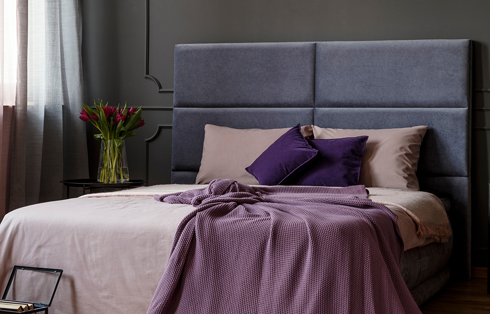
The Royal Regency Hotel in Yonkers, New York, recently underwent a brand transformation (as well as an ongoing building renovation) and connected with Hawthorn to develop a brochure as a primary component of their special events and wedding marketing toolkit for their hotel. But that “anchor project” was only the start of the work we went on to complete to give their brand the crisp, modern overhaul they desired.
The Client
The family-owned and -operated Royal Regency hotel is set in Yonkers, New York, a city of 200,000 just north of New York City. The purple accents everywhere – anchored by a grand staircase in the lobby complete with purple steps – suggest a fun, modern vibe. The hotel is welcoming to both business guests (it’s near many major companies and universities) and tourists (there’s easy access to sports venues like Yankee Stadium and cultural staples like the Westchester Broadway Theater), and weddings and special events remain a cornerstone of their business, with 14,000 square feet of event space.
The Project
The hotel’s marketing team came to Hawthorn as part of an effort to attract younger guests and re-assert the boutique hotel as a local destination, in addition to a place to stay. They had already worked with a branding agency who helped them affirm their rich, eccentric style – using those brand guidelines, Hawthorn produced a brochure to promote Royal Regency’s capabilities for hosting special events.
Royal Regency loved the design of the brochure (the epub link is now in their marketing team’s email signatures) enough that, in the following months, they sought Hawthorn to help modernize their thank-you notes, business cards, key card holders, and even do-not-disturb cards in the same vein with a shared aesthetic. It’s a consistent look across the board, and in the case of the do-not-disturb card (it sits in the key card slot of the door), they’ve found opportunities to extend their refreshed brand in previously ignored places.
Our Take
It’s not uncommon for us to work within existing brand guidelines (fonts, colors, photo guidelines, etc.) and in fact, it’s often a good test for our designers to chew on “how do I incorporate these elements into something new and fresh, but make them still feel on-brand?” It made the design process easier on our end to begin with a professionally done, well-executed set of brand guidelines, and it gave the project a head start.
Last Thought
There are a couple of benefits to starting with an “anchor project” like Royal Regency’s brochure. For one, it establishes an understanding of the design and production process with the client and also a sense of trust. Then, chipping away at other projects as they arise and both parties become comfortable with each other is a natural path to a fruitful, long-term business relationship, but is also cost-effective, as it’s a smaller time investment after the big project (the brochure, in this case) is completed. The final result is a package of collateral, done over several months, that works seamlessly together, and a relationship with an agency that’s ready to move quickly when the next need arises.


