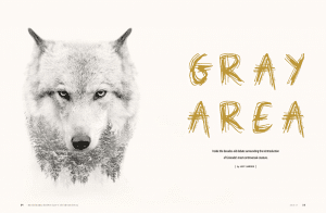
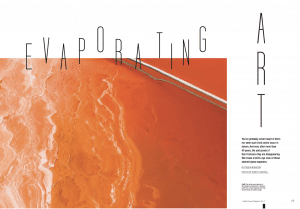
Often an overlooked component in marketing messages, typography is the written version of “it’s not what you say, it’s how you say it.” Two messages containing the exact same words can have two entirely different messages, depending on the typography choices. At Hawthorn, it’s something we notice every day on the monitors of our designers’ – it’s amazing to see how different text can look and feel based on the typography choices they make. Look at two examples of our work below:
The scratchy typeface on the graphic on the left (from Mosaic magazine, produced for Benchmark Hotels & Resorts) matches the content – in this case, a story about the reintroduction of wolves in Wyoming — by invoking associations with the wild. On the right, this image (from Noble House magazine, produced for Noble House Hotels & Resorts) features a condensed typeface that expresses an “into thin air” feeling that goes hand-in-hand with the title: “Evaporating Art”.


Creative software offers people the ability to easily toggle between typefaces and fonts (and yes, there is a difference). And interestingly enough, we may have Steve Jobs to thank for that. During his commencement speech at Stanford in 2005, Jobs discussed how he had taken a calligraphy class 10 years before designing the first Mac, and because of that, the Macintosh was the first computer with beautiful typography, and likely prompted the same progress in all future PCs, too.
While a different typeface is just a click away for today’s marketers, the same is true for their competitors — and because of that, it’s more important than ever to distinguish your brand with meticulously-selected typography. But how?
3 Burning Typography Questions, Asked and Answered
Typeface vs. font – what’s the difference?
The term “typeface” would broadly apply to Times New Roman and all its versions. A font, on the other hand, describes a specific subset of a typeface – Times New Roman, bolded, in 14 point type, for example. Today, most people use the terms interchangeably, though some designers still prefer to be accurate in their terminology.
How should you approach picking fonts for print versus digital use?
Not every font can be used online. “Web safe” fonts are fonts that are either standard system fonts (fonts that your computer comes with), or fonts that are specified in the code of a website and are rendered in your browser. Print, of course, has no such limitations. If there’s a print font that you’d like to use that isn’t web safe, try to find a comparable font to use for digital projects.
What’s the difference between a serif and a sans serif font?
If a font is considered “serif”, that means it has flourishes on the ends of at least some of the characters. Think Times New Roman. Most novels are written in a serif font. Sans serif fonts, on the other hand, don’t have these flourishes — a well-known example would be Arial. Sans serif fonts are often considered more readable on the web for long passages of text.
The Impact of Typography on Brand Messages
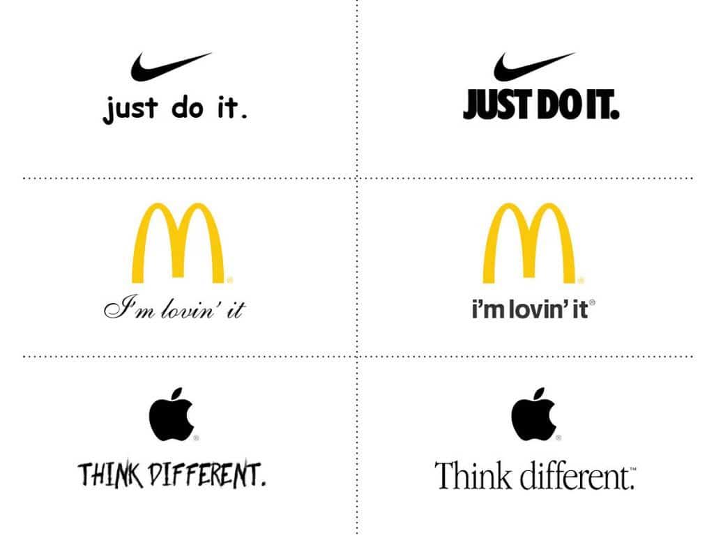
We’ve remixed some iconic slogans with different typefaces. The typefaces they use range dramatically but work perfectly for those specific brands. Look at how much less effective those messages are in a different font:
Typefaces to Consider
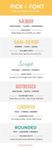
Forth and Create posted an excellent resource for choosing a font for your brand. Consider your customers and how you’d like them to see your business. What type of font would best help you deliver your message?
If you’re in tourism marketing and your target audience is families, a non-threatening, inviting, rounded font may be an appropriate choice. If you’re creating tourism ads and would like to inspire a sense of adventure, a distressed font may give your message an audacious flair. If you’re working on a hotel promotion targeting seniors, a classic, recognizable serif font would be a safe pick.
Influence Via Typography
Still not convinced whether the typography you use will have an impact on your marketing? The New York Times set out to get to the bottom of the issue by quizzing more than 45,000 readers in an informal study in 2012. Serif fonts – specifically Baskerville – ranked as the ones readers most agreed with, while Comic Sans ranked dead last. Ah, ol’ Comic Sans rears its ugly head again. Safe to say, you won’t find that font used in any of our work today.


