Making a strong impression in your office can go a long way toward earning repeat business from your existing clients. In Part 1 of our 4-part series on the influence of on-site tactics on medical aesthetic practice sales, How to Prepare Your Medical Aesthetics Staff for Consultative Selling, we led you through how to turn your team into a well-oiled sales machine. Now that your staff is geared up to provide your clients with an educational and inspiring experience, you need to make sure that you have the suite of collateral to match.
Your office is likely already filled with print pieces to engage your customers, but are they the right pieces? Do they feel luxurious? Do they set you apart with aspirational visuals and inspirational language? Do they spark emotion? If not, it’s time to revisit the tried and true and make it new.
When brands create emotional connections, they earn lifelong customers. This is the foundation upon which compelling and effective brands are built. But an impactful brand experience is not just about a pretty logo and soft colors. It’s about cultivating a set of values, experiences, and stories that a consumer can consistently count on and connect with. Medical aesthetic businesses already operate and thrive on human, in-person connections. This makes a strategic print presence key.
The first step is to rethink the focus of your materials. Yes, your customers need to be able to make educated decisions regarding their health and beauty, and you need to make sure that you’re informing them of the risks of certain procedures and the science behind why these solutions really work. But, that shouldn’t be the driving force behind these materials. Instead of starting with “what do I want my clients to know?” ask yourself “what do I want my clients to feel?” The answer to that question is where you will find the inspiration for crafting collateral that will resonate with your customers long after they’ve stepped outside your doors.
Here’s a look at some of the themes – and respective elements to employ – to inspire your in-office collateral.
Glamourous & Luxurious

Design Elements to Achieve the Look
Classic serif fonts, soft neutrals, shining metallics, strategic use of black and white
Brands to Look to for Inspiration
Vogue, Estée Lauder, Chanel
Happy & Lighthearted

Design Elements to Achieve the Look
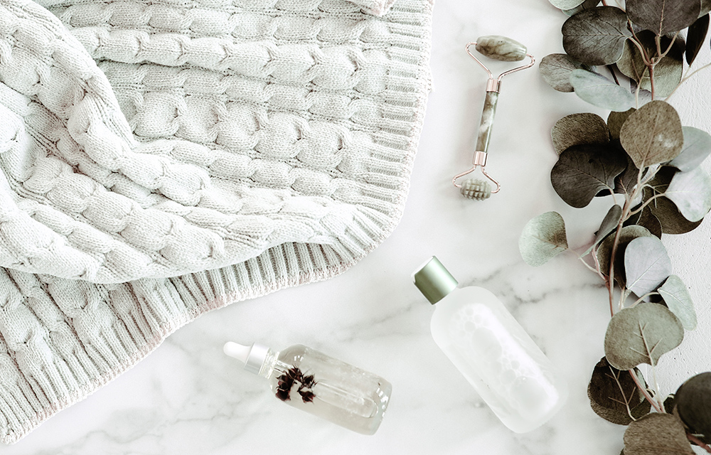
Pops of color, beachy tones, smiling faces, whimsical typography, light/white backgrounds
Brands to Look to for Inspiration
Tiffany & Co, Lily Pulitzer, Vega Vitality
Comfortable & Informed

Design Elements to Achieve the Look
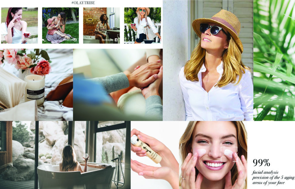
Pull quotes of facts and figures as opposed to walls of text, warm/comforting images, calming colors, soothing neutrals, storytelling
Brands to Look to for Inspiration
Olay, Dove, Fabletics
From logo and letterhead to service menus, on-site promotional materials, and more, we’ll make sure your collateral presentation is consistent with your brand message and catches the eye of your customer at every possible touchpoint.
This blog post is Part 2 of our 4-part series, The Influence of On-site Tactics on Medical Aesthetic Practice Sales. Be sure to check out the other posts:


