As a florist who does weddings, a professionally designed website is your most important marketing tool. According to The Knot’s annual wedding report, the “overall look and feel” is second only to budget on the list of most important considerations for a wedding, and flowers are a huge part of that. Since couples primarily shop for florists online, websites that convey beautiful, creative work through amazing pictures are going to be most successful. Florists are arguably the most visual of all wedding vendors, after all! We’ve been building compelling websites for florists throughout the country, and during our competitive research we’ve found several key elements the best websites share:
Three Design Features the Best Florist Websites Have in Common
#1: Minimal text
Couples shopping for wedding florists are trying to establish three things very quickly: whether they like your style, whether they can trust you with the biggest day of their lives, and whether you’re in their price range.
Even if you write like Hemingway, your target audience likely doesn’t care much. They want to see that you know flowers, not words.
First and foremost, a good website represents your style and body of work. Secondly, it establishes trust by showing that you care enough to present your work in a professional, well-designed manner. Whether you put pricing on the site is up to you, but if you’re able to demonstrate that your style is a match and that you’re professional, price becomes much more negotiable. Style and trust can both be conveyed through pictures, with minimal descriptive text.
#2: High-quality, professional pictures
Large, high-quality photos have a powerful effect on website visitors. Little thumbnails won’t do anymore – today’s wedding shopper wants to scroll quickly and see a great breadth and depth of work.
The best sites include a combination of emotional shots, such as joyful bridal parties, and detail shots (e.g., that beautiful centerpiece up close). Most importantly, the best sites have professional photographs, not blurry iPhone 4 shots or uninspired compositions. For this reason, florists who feature shots of their work taken by wedding photographers top the list (luckily, most photographers are honored to have their work featured on such websites free of charge and, at most, ask to be credited on the photos.)
SOLUTIONS
Take Your Prospects from Browsing to Buying
Break through the noise in a crowded digital landscape
#3: Mobile-friendly, mobile-first design
The Knot’s 2017 wedding industry report, based on a survey of nearly 13,000 couples married in 2017, found that 92% of couples used their phones for wedding planning activities. This underscores the fact that successful websites have to look great and function well not only on a desktop computer but also on phones and other mobile devices. Specifically, users expect to scroll on their phones – it’s become a natural part of their daily lives, and they don’t want to wait long, so the best sites are built with responsive design and are optimized to load quickly for those times when users aren’t attached to high-speed Wi-Fi.
Four Florist Websites that Inspire
Without further ado, we are happy to share this list of what we consider to be strong wedding websites out there today to serve as a source of inspiration.
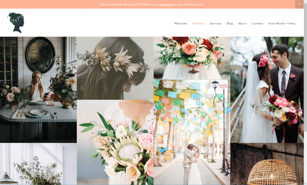
What we like: Modern design, professional pictures, and straightforward sitemap. It’s obvious what they do and how to learn more about them.rn design, professional pictures, and straightforward sitemap. It’s obvious what they do and how to learn more about them.
What we think could be better: The home page is a beautiful background slideshow, but the “splash” page with a single link to “Explore” is outdated. It’s much better to help people find what they’re looking for from the home page. At least the link does go directly to the portfolio section, which is the best choice if you’re going to do a single link.
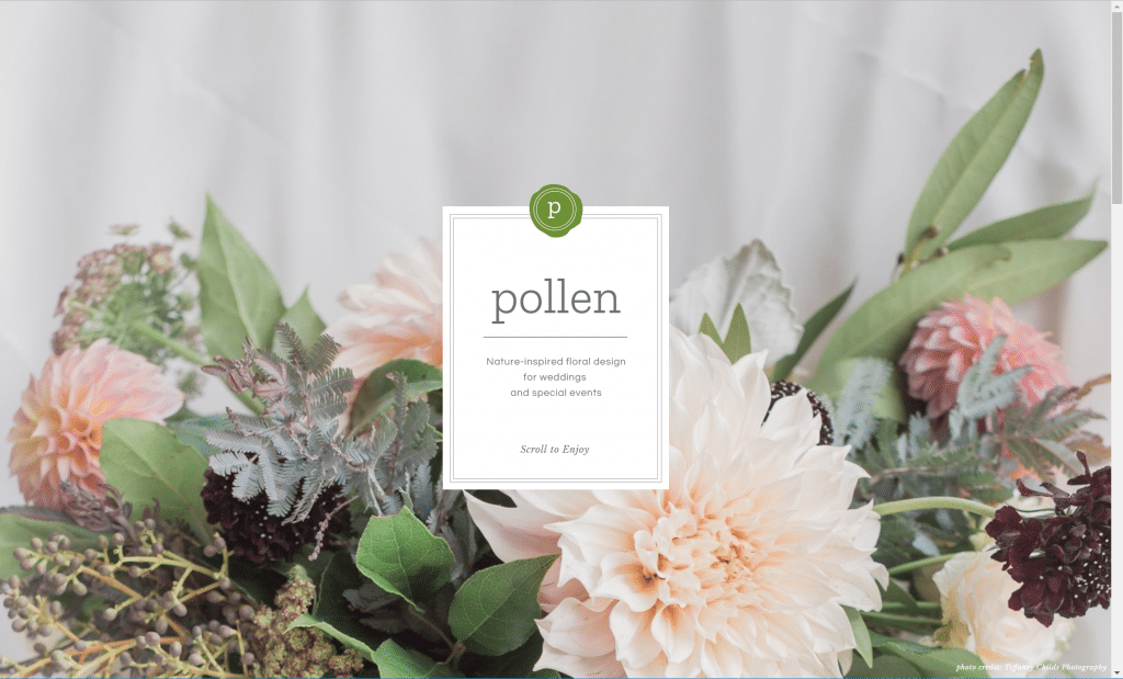
What we like: Custom, elegant design. Smart use of the blog to keep up to date with recent weddings without having to redesign the site every time a new wedding feature comes through.
What we think could be better: Minor nit, but the green circle with the number in it, while a useful design feature, is used inconsistently from a user experience point of view. For example, on the portfolio page, the top 1/2/3 open up galleries within the page, and when you scroll to the bottom, you see more 1/2/3/4, which you would expect would show you other galleries. Instead, they take you off the page, which is a little confusing.
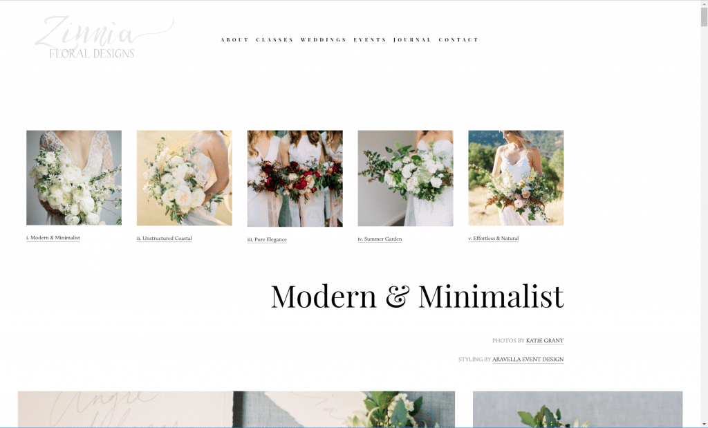
What we like: Beautiful, professionally shot pictures. Interesting combination of smaller and larger photographs and a well-balanced mix of detail and people shots. Works well on a mobile device. A clear description of the process of working with them (albeit a little verbose).
What we think could be better: The “New Products” link in the “Weddings” menu appears not to have any content on it. Fonts are a little small.
Ginger & Blooms Wedding and Floral Design
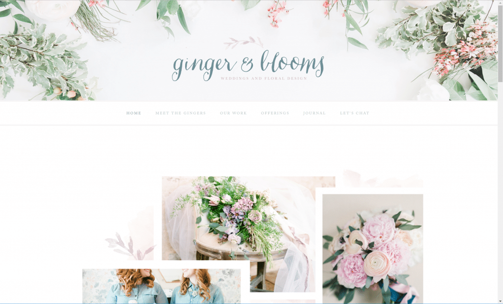
What we like: Elegant design, unique header graphic, custom artistic elements, great pictures.
What we think could be better: Not a great site when viewed on a phone. Seems like quite a few clicks to get through to a wedding gallery, so that process could be streamlined a little bit.
We hope you’ve enjoyed our look at great websites. Could your site could use a little love to compete with these?


