As a caterer, a professionally designed website is the most important marketing tool you can have. Your prospective customers aren’t using the Yellow Pages anymore, and whether they’re looking for a wedding, corporate, or social event, they’re going to be researching you and your competition online. Websites that convey your fantastic food and services through amazing pictures are quite simply going to be most successful. We’ve been building compelling websites for caterers throughout the country, and during our competitive research, we’ve found several key elements the best websites share. Here’s our take:
4 Features the Best Catering Websites Have in Common
#1: Give people what they’re looking for
Couples shopping for a caterer are trying to establish three things very quickly: whether you do what they’re looking for, whether you’re professional and capable, and whether you’re in their price range. Even if you write like Hemingway, your target audience likely doesn’t care that much about how you got started in cooking, how hard you work, etc. They want to see that you know how to prepare and present sumptuous food for their wedding.
A good website should clearly represent what you do – if most of your work is for weddings, make sure it’s really easy for them to see that. Secondly, a well-designed website is going to establish trust by showing that you are a professional – that your food is great and that you care enough to present it nicely. Whether you put pricing on the site is up to you, but providing sample menus and price ranges are ways to make sure the right prospects are reaching out to you.
#2: High-quality, professional pictures
Large, high-quality photos have a powerful effect on website visitors. Little thumbnails won’t do anymore – today’s wedding shopper wants to scroll quickly and see beautiful detail shots.
The best sites show that you know what you’re doing. Most importantly, the best sites have professional photographs, not blurry iPhone 4 shots or uninspired compositions. For this reason, caterers who feature shots of their work taken by wedding photographers top the list (luckily, most photographers are honored to have their work featured on such websites free of charge and, at most, ask to be credited on the photos.)
SOLUTIONS
A Full-Service Package to Sink Your Teeth Into
Get a taste of our cost-effective restaurant marketing solutions
#3: Mobile-Friendly, Mobile-First Design
The Knot’s 2017 wedding industry report, based on a survey of nearly 13,000 couples married in 2017, found that 92% of couples used their phones for wedding planning activities. This underscores the fact that successful websites have to look great and function well not only on a desktop computer but also on phones and other mobile devices. Specifically, users expect to scroll on their phones – it’s become a natural part of their daily lives, and they don’t want to wait long, so the best sites are built with responsive design and are optimized to load quickly for those times when users aren’t attached to high-speed Wi-Fi.
#4: Search Engine Optimization
90% of all website traffic comes from the first page in Google Search, and caterers are no exception. If your company is hidden on page two, your customers won’t find you. The best catering websites contain fresh, keyword-rich content and pay close attention to the other essentials of SEO, such as optimized meta tags, page speed, mobile-friendliness, user experience, and backlinks from other relevant, reputable websites.
Without further ado, we are happy to share this list of what we consider to be strong wedding catering websites out there today to serve as a source of inspiration.
Four Catering Websites That Inspire
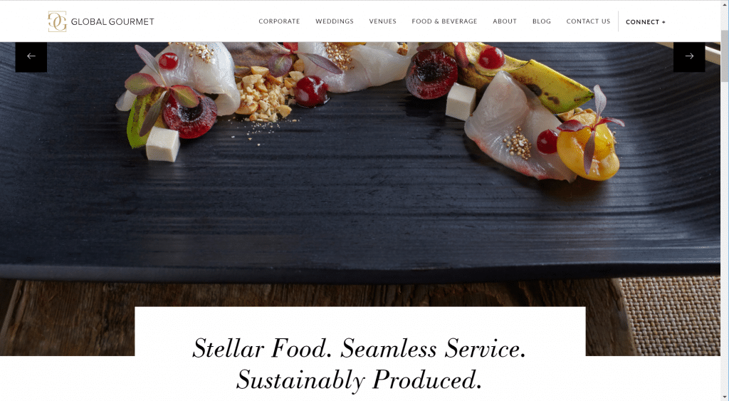
What we like: Beautiful, professionally shot pictures. Interesting combination of smaller and larger photographs and a well-balanced mix of detail and event layout shots. Sophisticated choice of fonts and minimal color scheme. Very easy to navigate. Elegantly styled menus.
What we think could be better: It’s a challenge to find something wrong with this site, but one observation is that you have to scroll quite a bit to get to the text – almost as if the header images are a little too large.
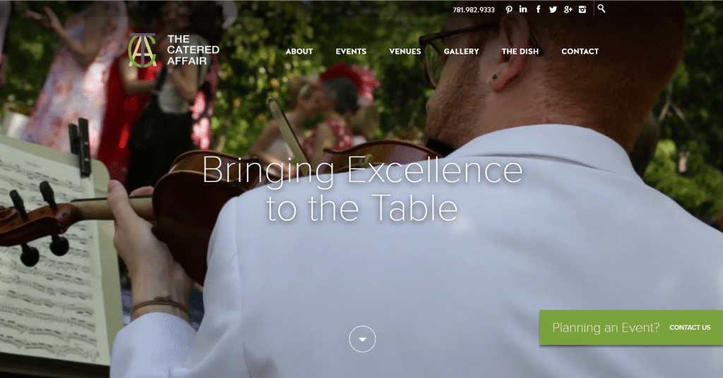
What we like: Clean, modern design and straightforward sitemap. Very easy to find what you’re looking for from the navigation, whether you’re looking for a corporate event, wedding, or personal celebration. Minimal text makes it easy to skim. Outstanding photography that really gives you a great idea of how talented this catering company is.
What we think could be better: Not much to critique here, besides the lack of sample menus.
OUR WORK
Build A Website Powerhouse
Within the first three months, this new site drove a 200% increase in conversions
What we like: Custom, elegant design. Header video that adds movement, shows a level of sophistication and helps you imagine yourself in the event. Beautiful pictures. Great use and implementation of venues as a strong show of social proof.
What we think could be better: It can get a little text heavy at times, particularly on the inner pages. The first navigation item is “About,” which goes against our tenet of making the site about the user, not about you.
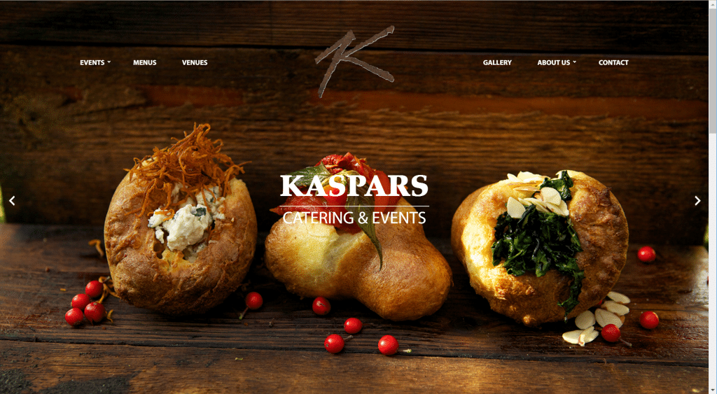
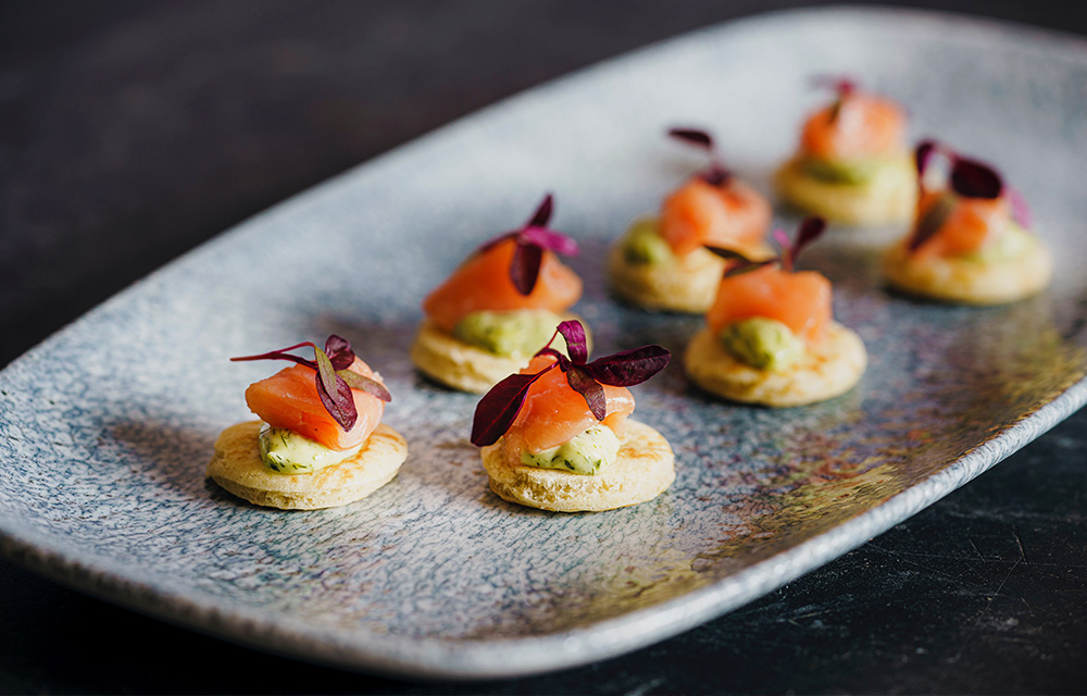
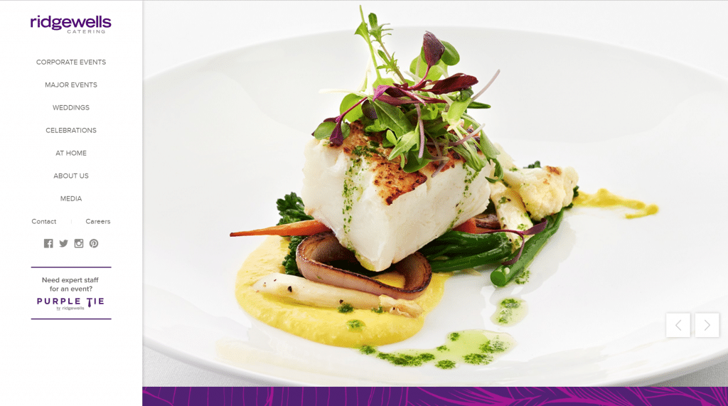
What we like: The photo quality is amazing and simply mouthwatering. The navigation is streamlined – it’s easy to get around and everything you are looking for is quick and easy to find.
What we think could be better: The “Menus” page falls apart a little bit when viewed on a phone. While gold is probably their branding color, it can be a challenging color on websites. Gold doesn’t glimmer and shine on a screen, so it can feel very brown/orange and is not all that appealing, especially when it’s used in big blocks as it is with the buttons on this site. Contrast this use of gold with the use of it on the Global Gourmet site (above), where it’s used sparingly in the logo and in thin font treatments.
We hope you’ve enjoyed our look at great websites. If your site could use a little love to compete with these, check out our website services!