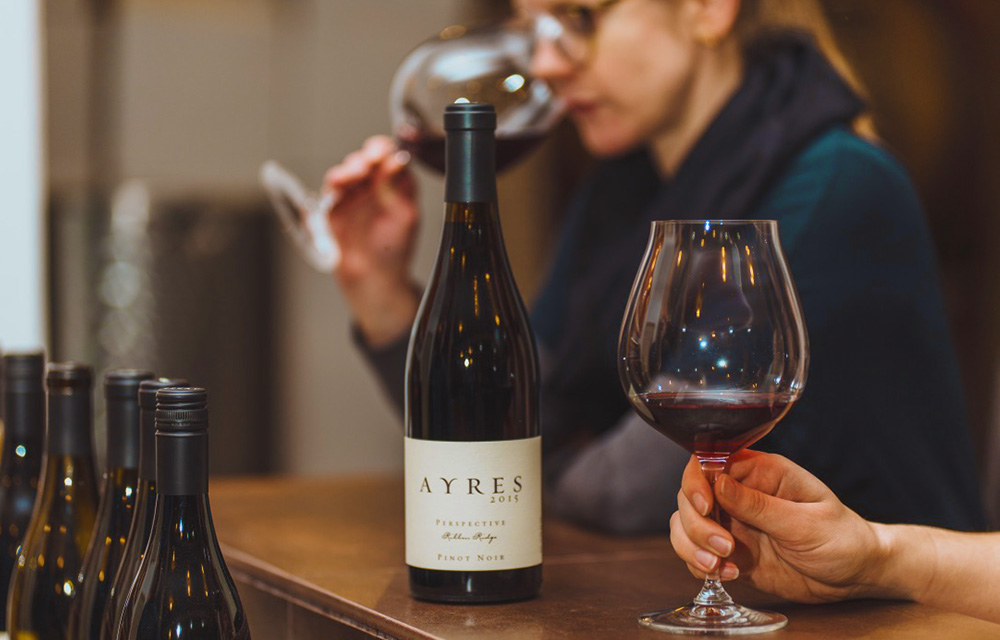
Ayres Vineyard & Winery’s blossoming relationship with Hawthorn began years ago when they first advertised in Roots, an in-room custom magazine we produce for Allison Inn & Spa in Oregon’s celebrated wine region, the Willamette Valley. Kathleen and Brad McLeroy’s story as the founders of Ayres traces much further back – almost 20 years, in fact – to when the business was just a shared dream. Today, more than 15 years after the first harvest, the winery is known for its pinot noirs and personal, memorable tasting experiences that guests can share with the McLeroys. When this family winery needed a website design that could tell their charming origin story, welcome guests, and of course, sell more wine, they turned to us.
The Old Website
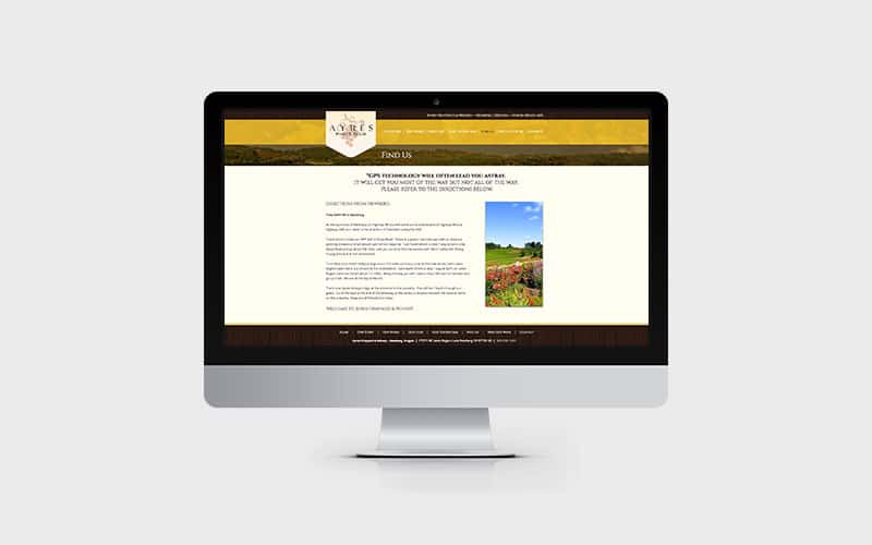
The previous website was, in a word, dated. Between the yellow background color, drop shadows, confusing navigation, and broken functionality (including not being mobile friendly), it was clear that the website had outlived its usefulness. Aside from the many aesthetic shortcomings, the site also didn’t show off any of their brand’s personality or tell a cohesive story – a major missed opportunity.
The Ingredients for the New Website
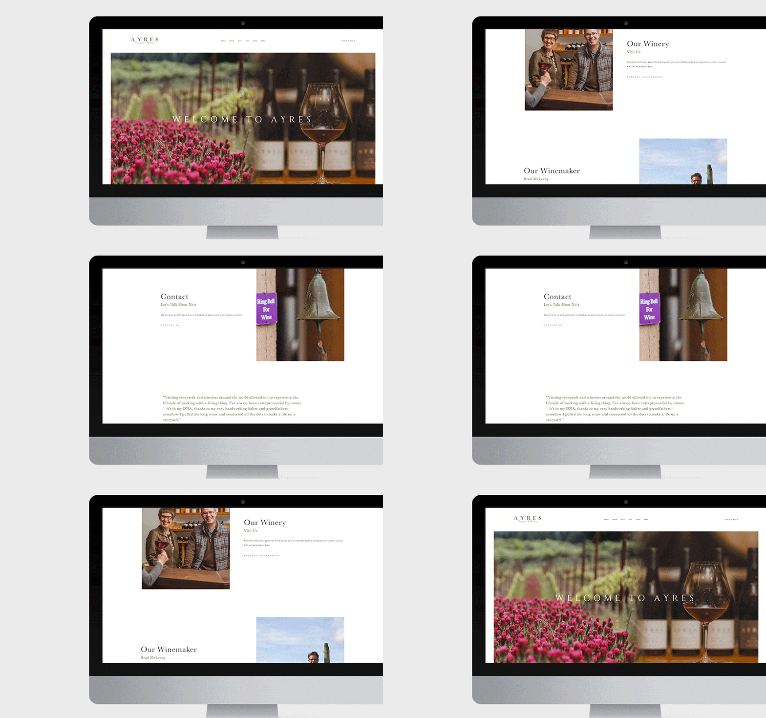
The client wanted something more polished, that only a professional website designer could produce. They also wanted plenty of white space, which was a welcome request – as big believers in the importance of white space, oftentimes we have to plead its case to clients who don’t initially appreciate its importance within the larger design. In addition, they commissioned a photo shoot prior to the website redesign, so we had excellent imagery to work with, making everyone’s lives easier. Finally, the message they wanted to resonate through the website was simple and clear: they were a down-to-earth, family-oriented, non-corporate winery.
Blending Images to Add Depth
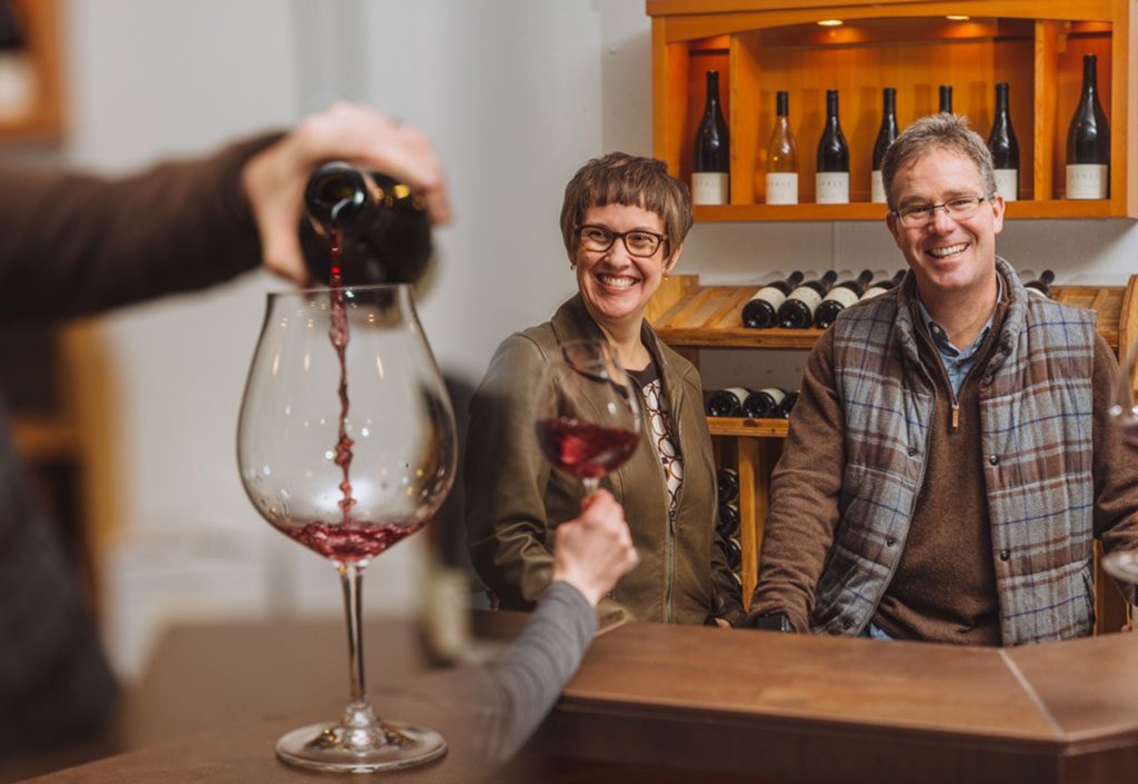 One standout element of this project was the use of collage imaging. Though the images were beautifully composed, we didn’t have access to the high-resolution versions, meaning they wouldn’t look good displayed by themselves across the page. Our solution? We artfully melded together two photos for some pages, and in that, told more of a story than one photo could on its own. The Visit page, for example, features a close-up of a pour on the left side, and the McElroys smiling on the right. At first glance, it looks like an original image, but in fact, it’s the product of two images being blended together.
Focused Product Pages
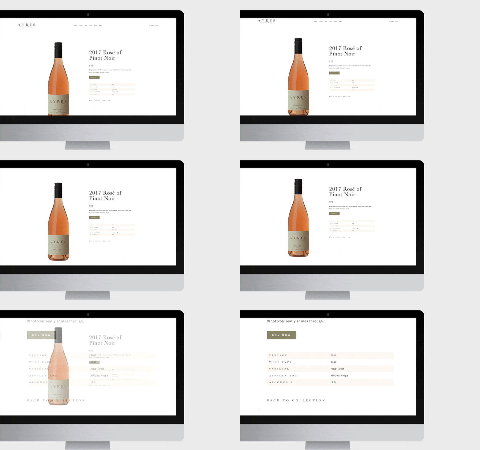
Most e-commerce pages look a little busy – but that aesthetic would look out of place on what is otherwise a sleek, gorgeous website. Instead, we stripped away the backgrounds from the wine bottle photos, giving them a bold look against the white background, and kept the text minimal. When you click on a bottle, it takes you to a page about that particular wine, sharing the year, a short description, a “Buy Now” button, as well as a specs table. The last element was a key ingredient, especially for wine nerds: We noticed that on other wine websites, they offered all sorts of details on the wine – something that was missing on Ayres’s site. So, we zeroed in on the things that mattered most to oenophiles (vintage, varietal, appellation, etc.) and shared those specs for each one.
A Seamless E-Commerce Integration
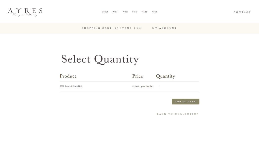 Ayres partners with OrderPort Winery Solutions, a third-party e-commerce web store, to handle all their wine orders. We worked to integrate the new website with their system and helped ensure that visitors wouldn’t notice that they were purchasing through what is technically a different website.
Telling a Story through a Timeline
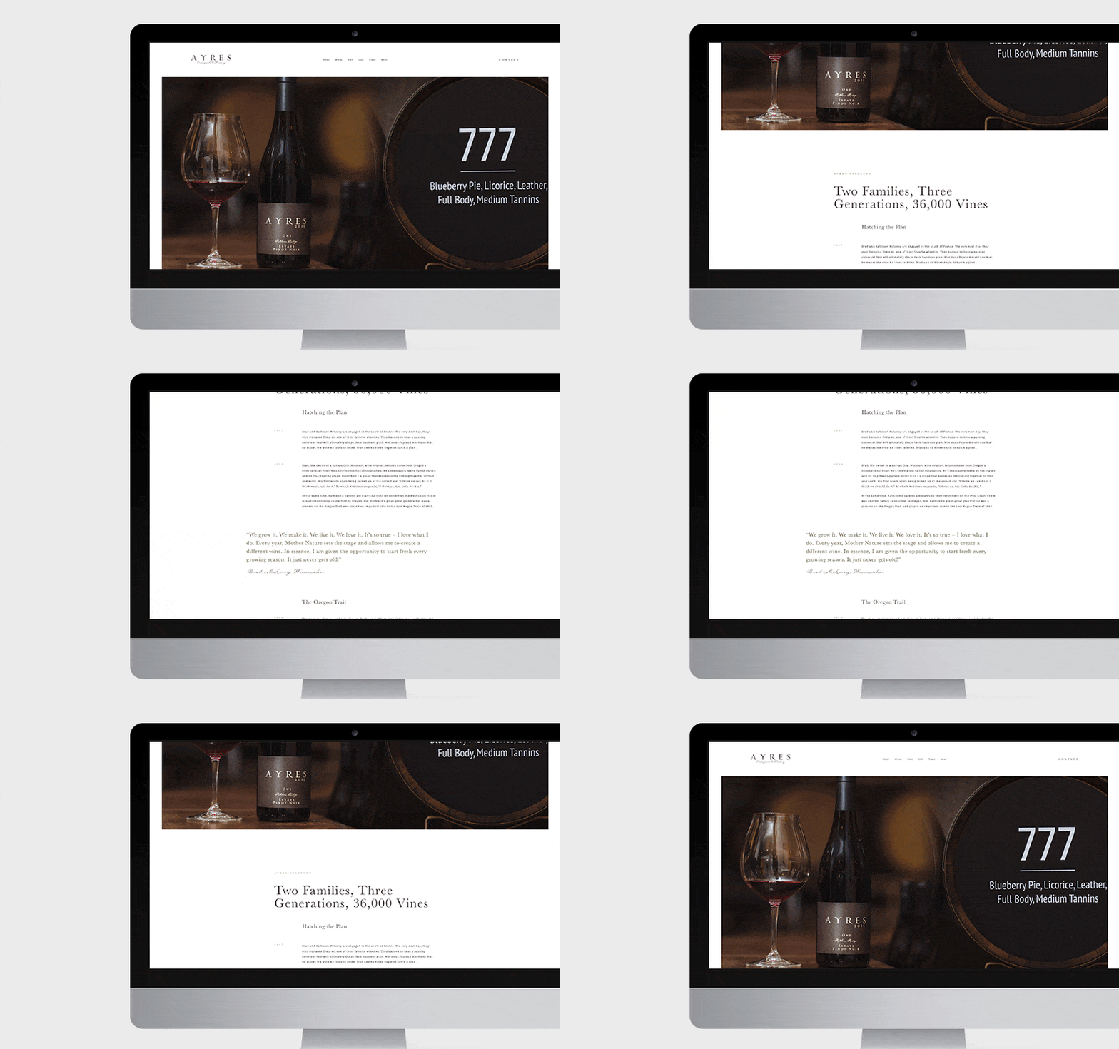
Wineries, like the product they produce, are intensely unique. Everyone who visits Ayres Vineyard & Winery is warmly welcomed, and we wanted the website to give people the same sense. On no other page is this more apparent than the About page, which is built around a timeline, dating back to 1997 when the couple got engaged in the south of France and had the initial kernel of an idea for the winery. We asked them to tell us about the major milestones – when they were inspired, when they bought the property, when they first planted, when the vineyard grew – and helped them tell a meaningful story that visitors will easily be able to browse through, connect with, and appreciate via a simple, cost-effective UX.
Avoiding a “Set It and Forget It” Approach
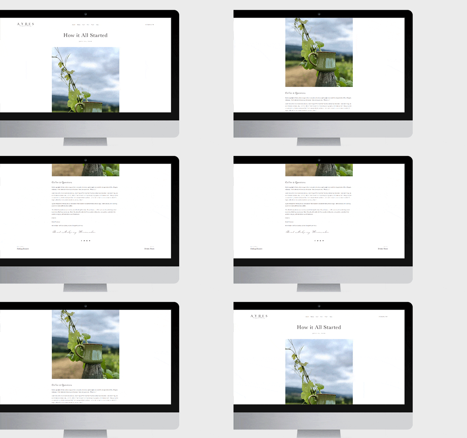
No business can think of its website as a “build it and forget it” project. For one, there will be changes and additions that need to be made – events to be promoted, landing pages to be created, new wine releases to announce, etc. So Ayres has contracted us as their website design agency moving forward on a small monthly maintenance retainer, which means no headaches for them as together we define the tweaks and adjustments that are needed for their business. Further, any good website should be the gateway to more business, not just a static presence. That means building a digital marketing strategy that gets people to click back to specific pages of the site via tactics such as a blog, social media ads, Adwords, email campaigns among loyal customers, and so on.
Be sure to check out Ayres Vineyard’s new website.


