From a photographer to a wedding planner to an events venue, these clients needed a new website design that yes, looked good, but also drove business.

Websites are your doorway to new business. A thoughtfully designed, purpose-driven website makes all the difference. Up until recently, websites of this caliber were only available to businesses with big budgets and six-plus months to invest in the project.
Now, utilizing Squarespace’s infrastructure, a marketing agency like Hawthorn can focus on nailing the design, navigation, and content of a website, and get the job done on a smaller budget and shorter timeline than previously thought possible. The difference is that Squarespace essentially allows us to remove the need for a web developer by making the interface designer-friendly. It still took a solid number of months for our designers to ramp up in full with the help of our director of technology (who stays involved to build the navigation and UX), but the end result is a process that reduces complexity and cost, and lets us focus on designing a strong site that drives engagement and action.
Here, we spoke with Hawthorn’s Creative Manager Kristen Ritzenthaler to help us pick apart three recently completed website design projects – what was wrong before, how we addressed it, and why their business is better for it moving forward – in a “before and after” review.
The Professional Photographer
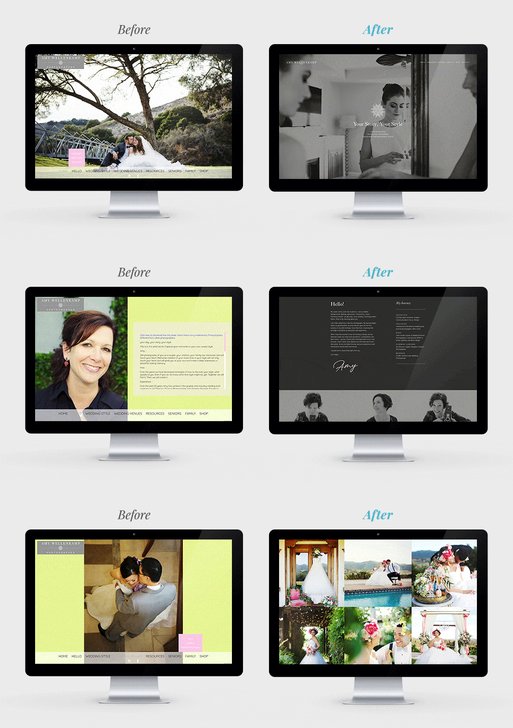
Photographer Amy Wellencamp’s website made visitors do too much work to find what they were looking for.
Main Goal: Make the information that people are seeking easier to find.
How We Did It: We focused on re-thinking and prioritizing the navigation on every page and designed around Amy’s three main customer “buckets.”
Kristen’s Take: “There was no cohesive story to Amy’s former website. The small images weren’t doing a good enough job showing off the amazing work she does. The site’s navigation wasn’t effective in getting people to where they needed to be. The menu was buried, and there was no way to scroll down and explore. We knew we had to address all that.
“For someone whose business is about her unique sense of taste, we knew it would be especially important to nail her aesthetic, so we started by putting together a mood board with a color palette, fonts, graphic inspiration, and more – and she raved about it. She has three big buckets of clients – senior portraits, weddings, and family shoots – so we positioned the website to showcase each of those things and gave each of them a landing page.
“In the end, it was about showcasing her already-amazing photos and letting the work speak for itself.”
The Event Planner
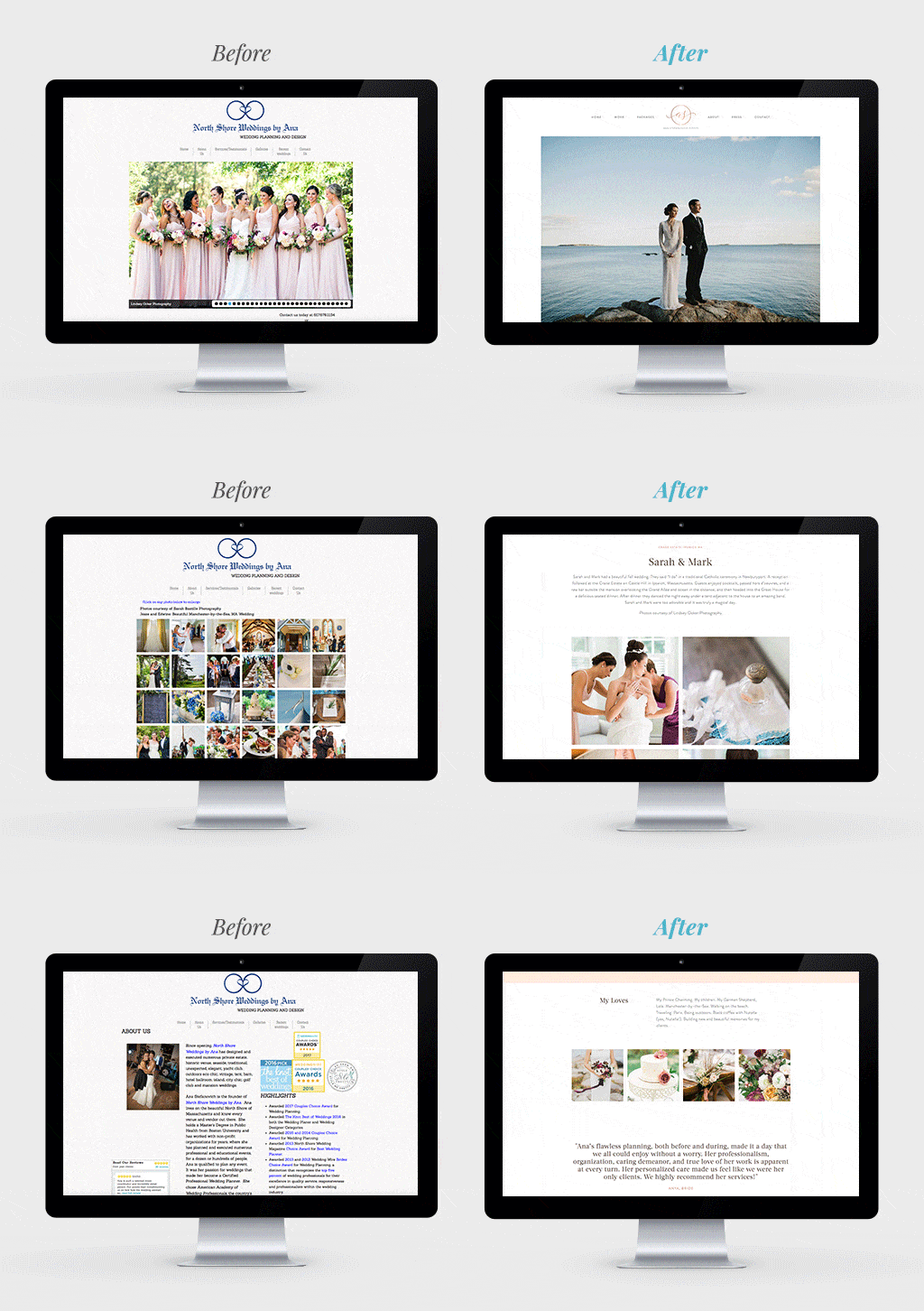
Ana Stefanovich of North Shore Weddings by Ana had a dated website that just didn’t do her work justice.
Main Goal: Modernize the website’s design and build around tasteful images that show off the quality of her work.
How We Did It: We scrapped the textured background and refreshed the typography, colors, and navigation.
Kristen’s Take: “In a business as visual as event planning, our primary concern was that the images didn’t grab you. When she submitted all the new photos to us, we knew we could work with them – they were all Pinterest-worthy, Instagram-gold-level amazing. Truthfully, we were almost surprised, because her old site didn’t reflect this caliber of work. It was important to us to show all the looks she can pull off: classic estate weddings, rustic weddings, tent weddings. With the old site, you couldn’t really tell what her style was, because there were just one or two photos of each wedding. On the new site, we set up a gallery for each featured wedding so that visitors can go deeper and really explore her work.”
An Events Venue
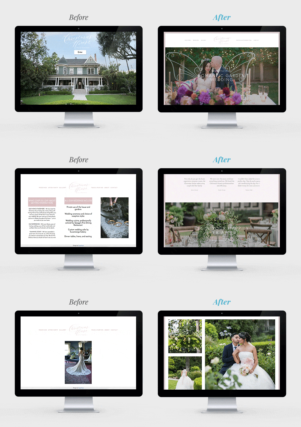
Christmas House Inn & Gardens, a historic venue southeast of Los Angeles, had a website that was re-done just last year, but there was one problem: it didn’t have a homepage.
Main Goal: Give the website a proper homepage and a design that’s true to them.
How We Did It: We dug into the ins and outs of their business – who their customers are, how they see The Christmas House, and what the biggest revenue drivers are – and designed using their already-built brand guide.
Kristen’s Take: “Their current site, which was done last year, doesn’t look bad: There’s white space, no hideous fonts, and good images. The clunkiest thing about it was that it didn’t have a good homepage. The homepage is the weddings page. As a visitor, you had very little idea who they are or what they do.
“One of the venue’s main challenges is its name, The Christmas House. Naturally, people assume the venue has a strong link with the holiday, but the name is simply a carryover from the business’s beginnings more than a century ago. So, understanding that struggle, we wanted to reimagine the brand, and what we learned is that they already have a beautiful brand guide with elements, fonts, hand-script lettering – but none of it was incorporated into the site. It baffled us. So, in the redesign, we used those elements and made them a big part of the site.
“Finally, we tried to spotlight the key revenue drivers and make exploring the site a more immersive experience for visitors. It wasn’t all about visuals, either – we wrote all the copy and built it around an SEO keyword package.”


