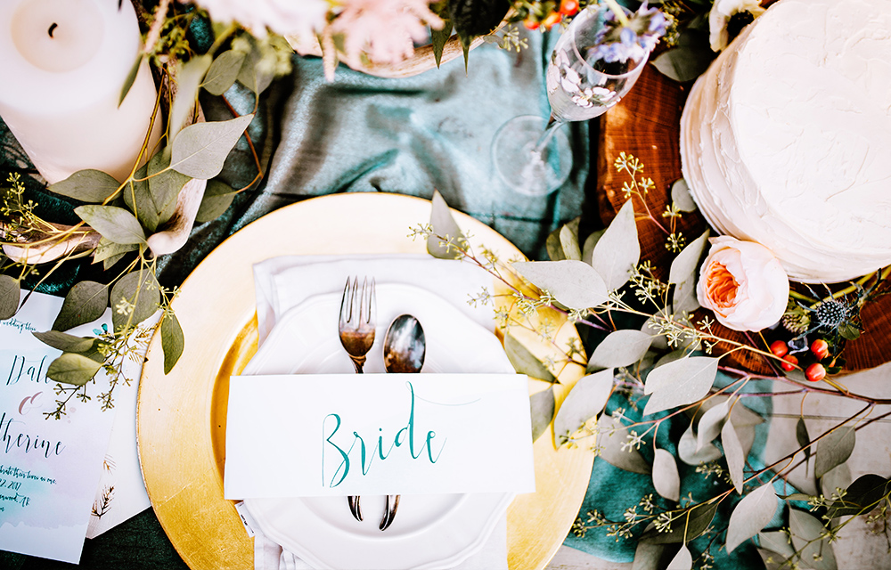
Wedding venue marketing relies heavily on selling visuals first. Here, we offer takeaways from design-first brand leaders like Nike and Snapchat.
User experience (or UX) isn’t just about web design. It’s the art and science of thoughtfully considering and designing every touch point a customer has with your brand. The concept of design-first doesn’t mean making things pretty above all else; it means designing things to to accomplish a specific purpose. As a wedding venue, you have many different touch points with a customer, from your listing on a referral site like Wedding Wire to your social media presence; from your brochure to a site visit, and so on. This means you have many opportunities to reinforce your best qualities so you stand out from the competition. It’s something we’re constantly looking as we work with wedding venue and hotel marketers every day.
Here, we look at four companies lauded for their design thinking and share a takeaway from each.
1. Airbnb’s Customer-Driven Approach
Some Silicon Valley companies spread designers across all their product teams or make a single design team that moves from project to project. Airbnb found that both these structures have their faults, so they implemented a new approach: Each product team has one project manager whose sole responsibility is to think like and represent the user. It’s easy to get lost in the lines of code and pixels, but it’s this person’s job to remember and remind his or her team that the most important moments of a customer’s experience happen in-person, so it’s crucial to nail that experience.
Wedding Venue Marketing Lesson
Always put yourself in your customer’s shoes as you create new collateral, update your website, or organize site visits. What information will they want to see right away? How will they want to spend their time with you? How do you want them to feel after they leave that experience? Create around their needs first.
2. The Beautiful Packaging of Apple Products
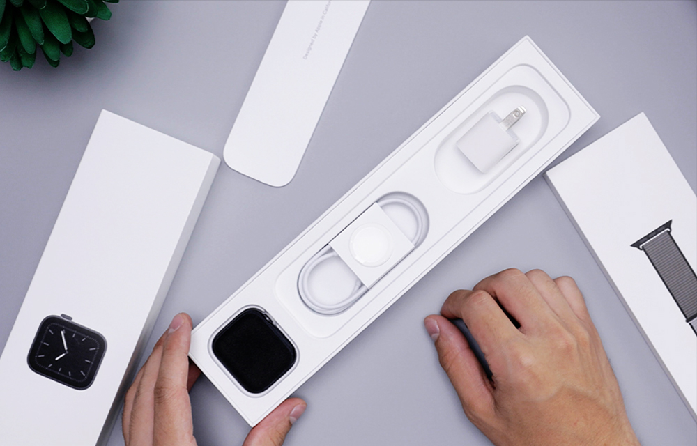
Whether it’s a Mac, iPhone, iPad, Watch, or any of their other gadgets, you’ll notice that Apple’s packaging is an experience in itself. Space is used very economically, and it’s always easy (and even a little fun) to unpack. Opening your new technology feeds into the anticipation you’re already feeling. In fact, Apple “unpacking” videos have become a YouTube genre in their own right. Talk about a marketer’s dream – people (willingly) watching someone unpack your product!
Wedding Venue Marketing Lesson
Like an Apple product’s packaging, your wedding brochure is ancillary to the purchasing experience. Neither of them are quite the “thing” – in Apple’s case, a shiny new object, and in your case, a beautiful wedding – but they add to the excitement of the experience and convey your aesthetic. When the site visit is over and all the client has in their hands is your brochure, you need it to push them over the edge and commit to your venue. Work with a partner who understands your business and will pay careful attention to the details.
3. How Snapchat Makes Things Easy for the User
Unless you’re in Snapchat’s target demographic, their interface may seem a little abstract, and you may be wondering why they’re on this list. Well, there’s one thing they do exceedingly well design-wise: They optimize for the fewest number of taps and swipes required to complete an action. Take the camera, for instance – on other apps like Facebook, Instagram, and Twitter, the camera was always a tap (or two) away. Part of the reason Snapchat was able to make inroads against their competition is because the app opens straight to the camera – no tapping required. That speed, which saves users (at most) about a second each use, is everything. For each new feature they introduce, Snapchat considers how to make it accessible in the fewest number of swipes and taps possible.
Wedding Venue Marketing Lesson
Sometimes web designers make the mistake of taking the user’s attention for granted. That’s a grave error in today’s hyperactive, multiscreen, 100-tabs-open world. Now, we’re not saying you need to cram all your information at the top of your venue’s homepage (please don’t!), but it is important to pare down all that content to just the essentials. When a couple visits your website, what will they be looking for? Always start by prioritizing that content and peeling away everything that isn’t essential.
4. How Nike Stood Out
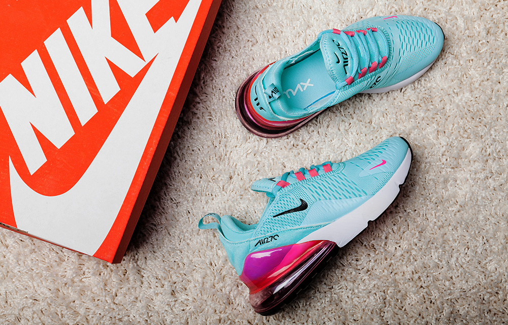
In Nike’s earliest days, company founder Phil Knight saw rows and rows of competitors’ shoeboxes at stores. While these companies had more prestige than Nike at the time, they all blended together with their bland cardboard color. Knight introduced orange shoeboxes to help his Nike sneakers pop off those shelves, and it worked. That iconic Nike orange is still in use today.
Wedding Venue Marketing Lesson
Zig where the competition zags. When you’re at bridal expos and wedding shows, all the booths will be doing their best to blitz attendees with their offerings. What’s your orange shoebox? Consider the elements that will make your booth stand out. It may even be worth a visit to another expo beforehand so you can make note of what’s working for the successful booths, and what doesn’t seem to be working for the ones that aren’t getting attention.
5. How Chipotle Designs Their Restaurants
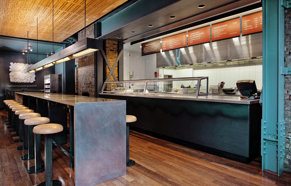
Have you ever noticed that when you’re in Chipotle, there aren’t any loud signs pointing out where to stand, order, and pay? Even for first-time customers, there’s no confusion about what to do. The customer experience is central to the space’s design, not an afterthought. The restaurant’s aesthetic – clean, minimalistic, natural-feeling – reflects the menu, but the actual layout is all about the customers.
Wedding Venue Marketing Lesson
When a couple comes to your venue for a site visit, you almost have them – but their presence and attention shouldn’t be taken for granted. Think about your site visits: Do you have a defined plan, from where the prospect parks, to how they’re greeted, what they’re given, and where they go? One potential standout experience: Giving the couple an iPad that’s preloaded with galleries (from your website or a Pinterest board) so you can direct them to a series of images that show what each space can look like fully designed as they walk through your venue.