Case Study:
The Press Hotel
How a bespoke hotel website and search strategy reached historic heights
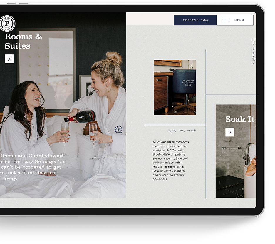
Tucked inside the building that once housed The Portland Press Herald, this boutique hotel has personality in spades. However, its previous website’s user experience left much to be desired on the creativity front. More specifically, it lacked the visual identity that The Press Hotel possessed and poorly communicated its distinct, newsroom-inspired character. As a Marriott hotel, this historic stay also struggled to attain and maintain brand equity in search results. It was forced to compete with not only OTAs, but with the Marriott brand site as well.
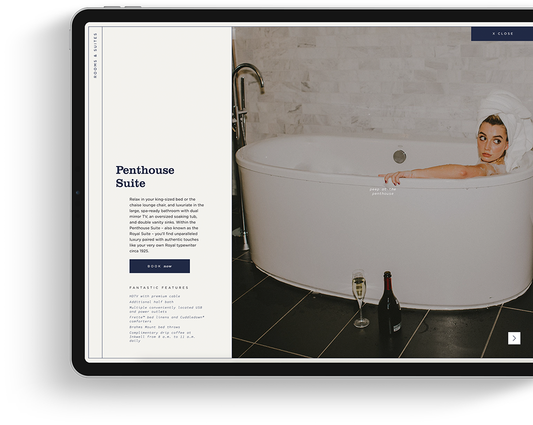
Although the direct bookings were a perk, Marriott’s cookie-cutter approach didn’t fit The Press Hotel’s unique style, ethos, and personalized guest experience. So, The Press Hotel turned to Hawthorn Creative’s web and marketing agency to reimagine its web presence. And did we ever! Our team transformed a run-of-the-mill website into a powerful, design-focused platform that accurately reflected the hotel’s rich history and aesthetic. Then, we launched strategic organic and paid search campaigns to make The Press Hotel’s charming accommodations front-page news in the SERPs.
See The Journey
“Defining the aesthetic for Press’s website was a creative’s dream. Pulling every detail, from local art installations to custom decor, as inspiration. The result? A visually stunning and strategically effective user experience.”
— Kristen Ritzenthaler, Digital Art Director
The Before and After Metrics Speak for Themselves
01.
200% Increase in Non-Local Traffic
While The Press Hotel was celebrated in Maine, its brand didn’t have much geographic reach beyond the state. From March 2022 to March 2023, Hawthorn Creative tripled the amount of traffic coming from cities like Ashburn, Virginia, and Washington, D.C. These weren’t web-window shoppers either: Out-of-state users converted at a remarkable rate.
02.
100% Increase in Google Ad Conversions
From March 2022 to March 2023, Hawthorn Creative also doubled the user conversion rate from Google Ads compared to the year before. Enhanced targeting and expanded geographic territories enabled us to capture more users looking to book. Then, the website closed the deal by showcasing their ideal stay experience.
03.
88% Increase in Time Spent on Site
One of the best measures of website experience is the amount of time users spend on your site. Visitors won’t tolerate a glitchy, unoptimized website – they’ll just bounce. In 2022, the new site saw an increase in the average time spent on the site from about one minute to more than two and a half minutes.
A headlining web experience for a newsworthy hotel
In honor of The Press Hotel’s publishing roots, we took a journalistic approach to researching its brand. Hawthorn Creative’s web team spent several days soaking up the Press guest experience. We studied its newsroom-inspired halls and stayed overnight in its rooms. We interviewed its dedicated staff members and shared a meal at Union, the hotel’s on-property restaurant which celebrates Maine’s seasonal fare. As we experienced everything, we jotted down copious amounts of notes, captured hundreds of photos and videos, and discussed every little detail and impression.
Inspired and pampered, our designers and strategists took to the whiteboard to begin architecting the wireframes that would serve as the blueprints for this show stopping site. We knew the website needed to be as creative and evocative as the art and exhibits hanging on the hotel’s walls. How did we make that happen? Editorial touches abound. Typewritten headlines, appearing letter by letter. Pixels of whitespace filled with a soft dove-gray newsprint texture. A horizontal scroll that makes you feel as though you’re flipping through the pages of the Herald. Even the lifestyle images and videos that appear on the website – a collaboration between Hawthorn Creative and Prism House – were thoughtfully planned and executed.


A reengineered SEO strategy formed a solid foundation
Unfortunately, the quote “If you build it, they will come” doesn’t apply to websites. To rise up the rankings and stay there amidst hot competition from OTAs and split brand equity due to a mammoth umbrella corporate entity is no small feat. In fact, when we first started working with The Press Hotel, it felt like the establishment was fighting a losing battle.
In the past, The Press Hotel had taken a very straightforward approach to search engine optimization. As a result, it was unable to find traction when it came to search. Hawthorn curated an optimized keyword list and holistically integrated key terms into the new website copy, metadata, and architecture. However, we knew the competition was too high to “set it and forget it.” We’ve continuously analyzed the search traffic and keywords and make ongoing updates to ensure these users are able to easily navigate the site and find what they’re really looking for.
A paid search engine strategy that really paid off
Previously, The Press Hotel had the same concerns regarding SEM as many of our boutique hotel clients: How do we compete against the likes of Booking.com, Travelocity, and Expedia? After all, if you search for accommodations in any city across the globe, these are the names you’ll see dominating the ads at the forefront of the SERPs. The key to beating the OTAs is simple: Don’t think like an OTA.
When approaching paid search and pay-per-click campaign planning, we challenged ourselves to find the unique terms and ideas that would drive an emotional connection with The Press Hotel’s audience. Sure, any site can bid on broad terms like “Hotels in Portland, Maine,” but how can you maximize ROI by presenting ads that immediately capture users’ attention? We created campaigns targeting multiple regions and examined that traffic to better appeal to the users who were most likely to convert. A picture is worth a thousand keywords, so we also leveraged the beautiful lifestyle and property photography that we had curated to create dynamic display ads that built brand awareness in regions outside of New England.
Explore More
Feeling inspired?
Browse our success stories
We love bringing brand experiences to life
See More Case Studies

