There are plenty of things hotels can (and should!) borrow from Airbnb, like their content marketing strategy, their super easy-to-browse website (and app), the way they incorporate data science into their marketing strategy, and how they collect and display guest feedback. But hotels won’t win this battle (though let’s be clear – it’s not winner-take-all!) by out-Airbnb’ing Airbnb. They should zig where Airbnb zags and lean into their strengths. Here are some ideas to consider.
Predictability
For some, the variance that you experience with Airbnb is exciting. While the listings may have plenty of photos, you never know exactly what you’re going to get until you arrive. We’re not saying every room of your hotel or inn should look the same, of course, but there’s some comfort for guests in having a baseline of what to expect, and you should lightly emphasize this point in your messaging. Vacations (and business trips, for that matter) can be stressful, and having one less variable to stress about – where you stay – can strip away some of that anxiety.
Safety
Similar to “predictability,” safety is an issue that you may not think prudent to address in any way with customers, but we’ve all seen the Airbnb horror stories in the news, and it’s opened up an opportunity. Safety doesn’t just mean security, but cleanliness, too. Be specific with your selling points – more specific than you would’ve been a decade ago – and give travelers peace of mind that they can’t get with an Airbnb. Make investments in this space and share your advances proudly.
On-site Expertise
The robust Airbnb content marketing strategy aims to make them an authority in destinations all over the world. But you (presumably) have a concierge service. Make this person recognizable on your social media channels and exceedingly accessible in-person. Give them their own social media channel that guests can engage with and quickly exchange DMs with. Further than that, you employ a building full of (presumably) locals – consider empowering them. Let them occasionally do takeovers of your social media accounts and take visitors around some of the best spots around your property (and on Instagram, make sure to make this a Story Highlight!) Finally, consider investing in an in-room magazine that reaches guests in the right place and at the right time.
Service
Last time we checked, Airbnbs don’t tend to come with daily housekeeping services or a front desk to handle billing issues face-to-face. If any number of issues go awry with the TV, plumbing, heat or A/C, etc. in an Airbnb, who’s there to help when you need it? The people who operate a hotel often fade into the background as part of a guest’s stay, but it’s worth highlighting that they’re there if you need them.
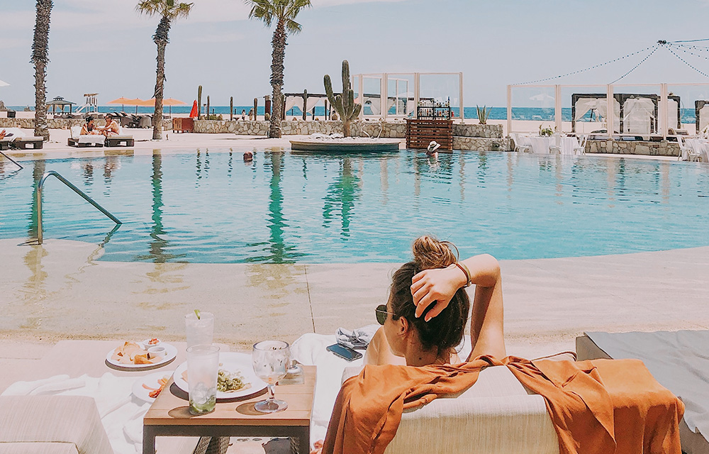
Amenities
It should be thought of as a luxury to get away from home. A stay at a boutique hotel or inn should be considered a vacation in its own right. Room service, pools, fitness centers, spas, and on-property restaurants punctuate this point. Knowing that you can eat and work out on-property takes away some thought and stress from the larger journey for leisure guests. For business travelers, this is even more true. Position these premium services accordingly, because that’s what they are.


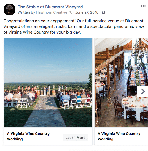


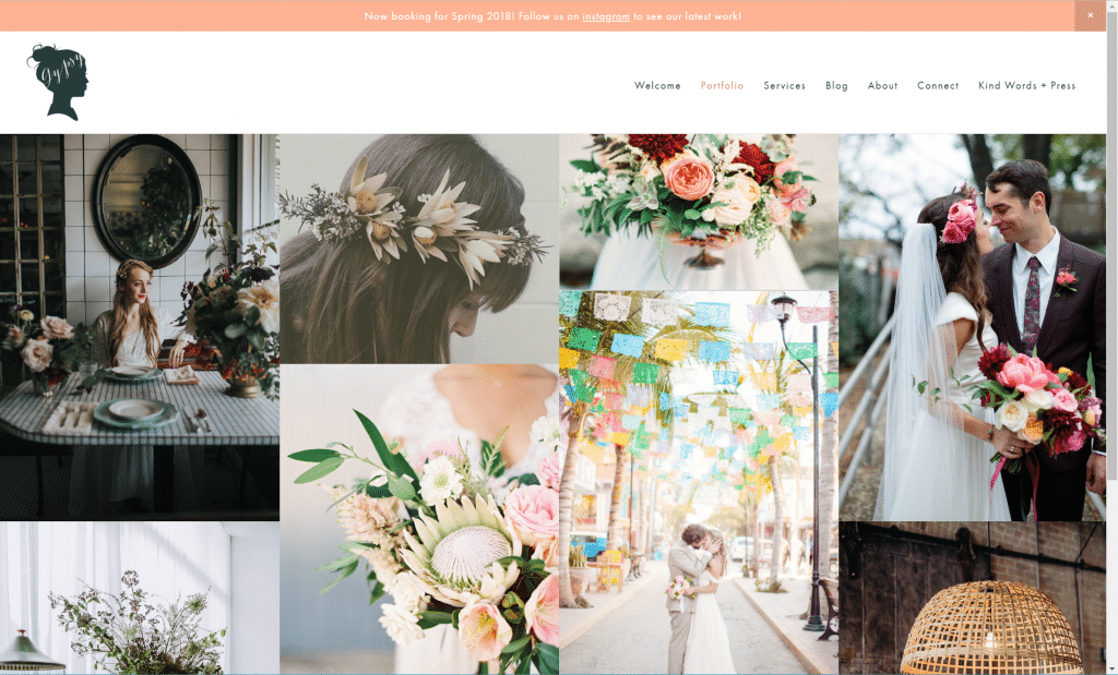

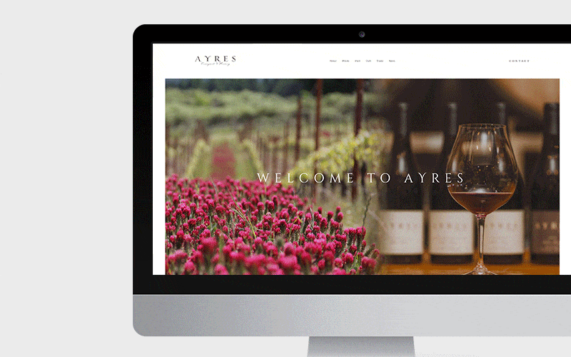
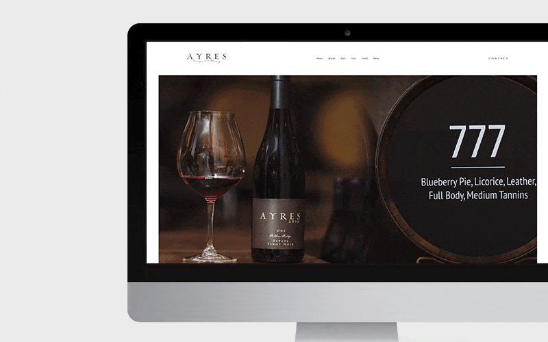
 One standout element of this project was the use of collage imaging. Though the images were beautifully composed, we didn’t have access to the high-resolution versions, meaning they wouldn’t look good displayed by themselves across the page. Our solution? We artfully melded together two photos for some pages, and in that, told more of a story than one photo could on its own. The
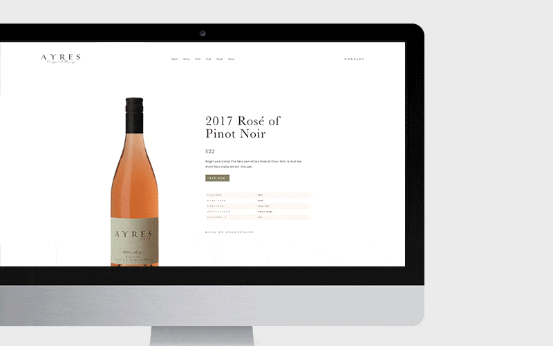
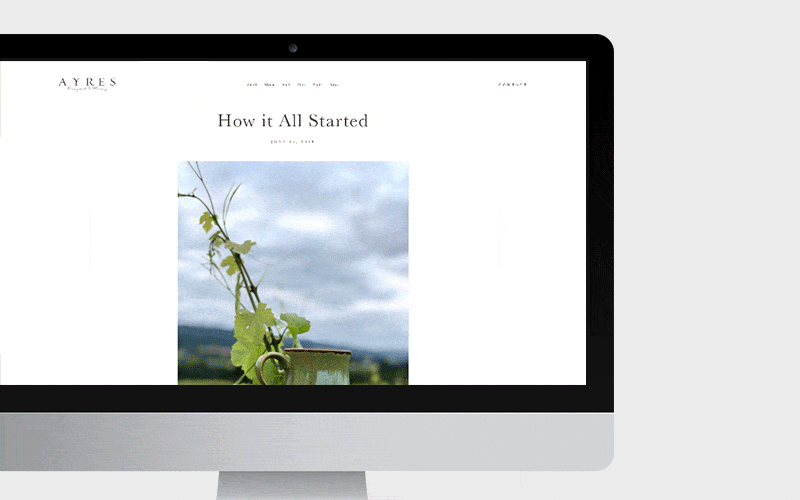
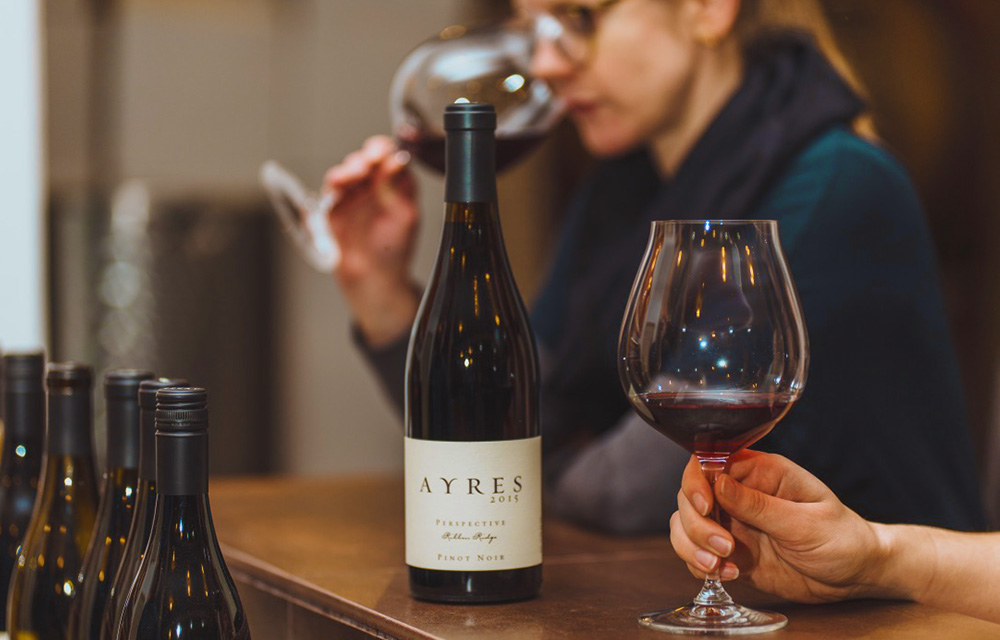
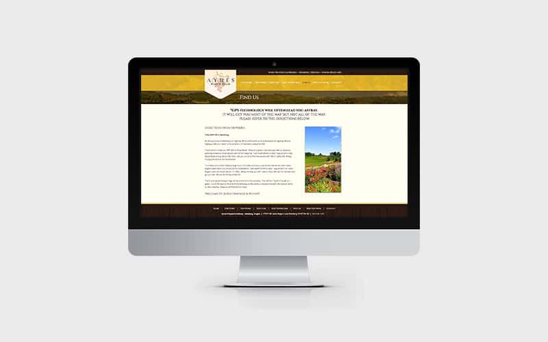
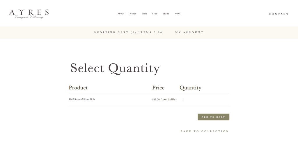 Ayres partners with OrderPort Winery Solutions, a third-party e-commerce web store, to handle all their wine orders. We worked to integrate the new website with their system and helped ensure that visitors wouldn’t notice that they were purchasing through what is technically a different website.