WeddingWire Vs. The Knot: For Vendors, How Do They Compare?

The Knot and WeddingWire help couples put together their big day and serve as valuable wedding vendor advertising channels. We spoke with a few savvy vendors about their experience with these two major online wedding marketplaces. Are they worth it? Is it one or the other? How do you succeed? Here’s what they had to say:

Yes, Invest in Both

These services are considered a necessary cost of doing business by most in the industry, and if you’re looking to make a living (or at least a healthy side-gig), you really can’t afford to not be there. For many, all it takes is one wedding to pay for the yearly membership. Plus, the longer you’re there, the more likely you are to notice a compounding effect of more reviews and increased visibility. That said, keep track of your numbers each year by channel, so that one, two, three years in, you can take a look at your return and how valuable each service is to your business.

The Value of a Good Lead

Anecdotally, we’ve heard that while The Knot drives more leads, they tend to be of lower quality. This may be an issue of scale – WeddingWire, while big, doesn’t attract as much traffic as The Knot. Unfortunately, (for the vendors we spoke to, at least) leads from The Knot are often not very qualified, and seem less likely to convert to bookings. In terms of the raw number of conversions, The Knot may be superior to WeddingWire, depending on your business, but you’ll spend time sorting through those leads, too. Remember that your profit per hour can’t just be calculated from the time you spend on the job, but also the time you spent managing leads and prepping.

Respond Quickly (without the Customization)

Since you’re very likely not the only vendor they’re sending an inquiry to, and since you may find that the inquiries you receive lack the information you need to deliver a fully custom response, time is of the essence. Hopefully you already have a boilerplate response to qualify leads no matter where they come from. If not, build one and make sure you fire it off quickly to qualify the lead. Naturally, also include your one sheet with your different pricing options. The point is, you don’t want to spend more than a few seconds on each inquiry so you can weed out those that aren’t qualified or truly interested – and get those that are into your funnel, not your competitor’s.

How Much Should You Invest?

There are different tiers that afford more visibility on both WeddingWire and The Knot. On WeddingWire, they’re referred to as Professional, Featured, and Spotlight, in ascending order of price. On The Knot, they’re Standard, Featured, and Premium. The perks occasionally change, but the bottom line is that you’re paying for increased visibility – and the price depends on the competition for your specific vendor category in your geographic area. Both services will try to hook you with discounts. One key difference: WeddingWire tends to be more expensive, but you get a representative from the company who checks in a few times a year and offers you customized tips, tailored to your needs, to help you increase inquiries and drive bookings. That’s a tough thing to quantify, but it’s certainly an advantage over The Knot’s less personal, more content marketing–driven approach.
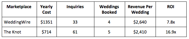
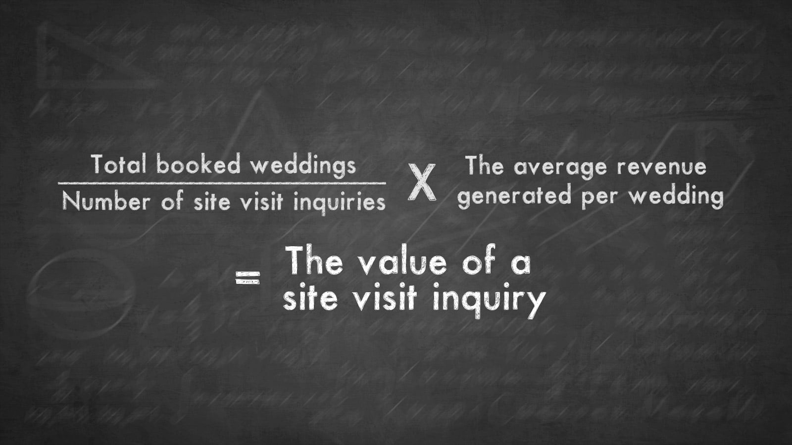
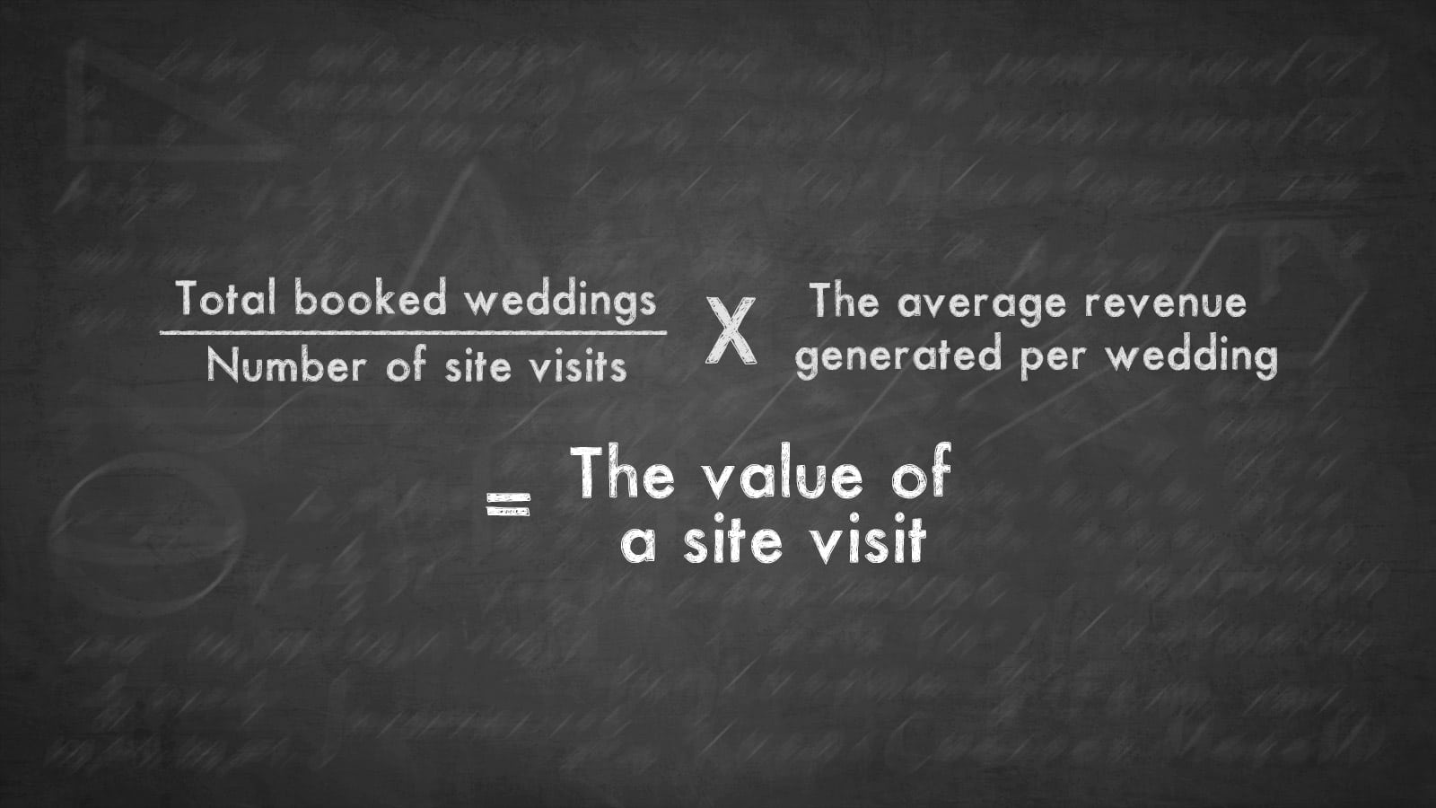
How It Shakes Out

One vendor, a New England-based videographer, agreed to share his numbers for 2017 for each service, which were basically representative of his experience since joining in 2015. While these figures are obviously unique to his business, they may help give a sense of the economics driving vendors’ decisions to use these services.
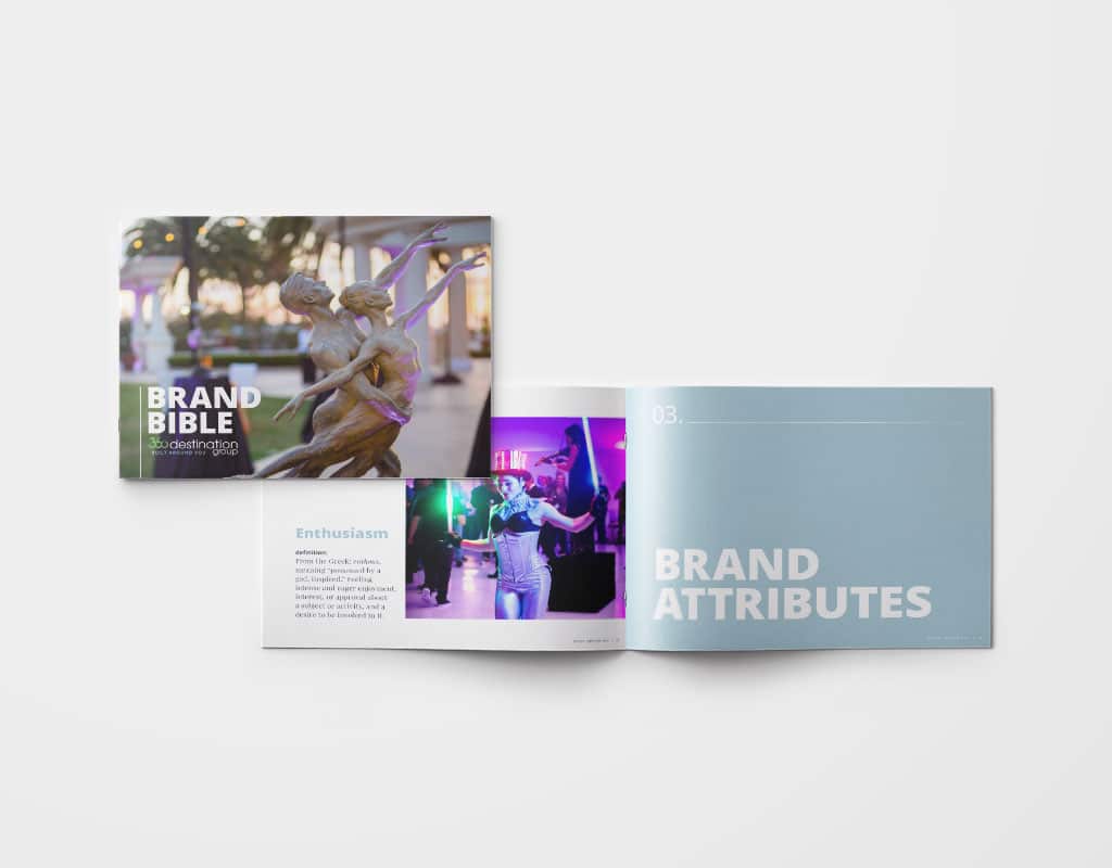
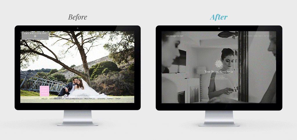
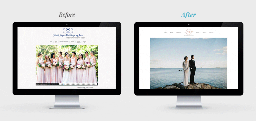
5 Lessons on Wedding Venue Marketing from Design Companies

Wedding venue marketing relies heavily on selling visuals first. Here, we offer takeaways from design-first brand leaders like Nike and Snapchat.

User experience (or UX) isn’t just about web design. It’s the art and science of thoughtfully considering and designing every touch point a customer has with your brand. The concept of design-first doesn’t mean making things pretty above all else; it means designing things to to accomplish a specific purpose. As a wedding venue, you have many different touch points with a customer, from your listing on a referral site like Wedding Wire to your social media presence; from your brochure to a site visit, and so on. This means you have many opportunities to reinforce your best qualities so you stand out from the competition. It’s something we’re constantly looking as we work with wedding venue and hotel marketers every day.

Here, we look at four companies lauded for their design thinking and share a takeaway from each.

1. Airbnb’s Customer-Driven Approach

Some Silicon Valley companies spread designers across all their product teams or make a single design team that moves from project to project. Airbnb found that both these structures have their faults, so they implemented a new approach: Each product team has one project manager whose sole responsibility is to think like and represent the user. It’s easy to get lost in the lines of code and pixels, but it’s this person’s job to remember and remind his or her team that the most important moments of a customer’s experience happen in-person, so it’s crucial to nail that experience.

Wedding Venue Marketing Lesson

Always put yourself in your customer’s shoes as you create new collateral, update your website, or organize site visits. What information will they want to see right away? How will they want to spend their time with you? How do you want them to feel after they leave that experience? Create around their needs first.

2. The Beautiful Packaging of Apple Products

Whether it’s a Mac, iPhone, iPad, Watch, or any of their other gadgets, you’ll notice that Apple’s packaging is an experience in itself. Space is used very economically, and it’s always easy (and even a little fun) to unpack. Opening your new technology feeds into the anticipation you’re already feeling. In fact, Apple “unpacking” videos have become a YouTube genre in their own right. Talk about a marketer’s dream – people (willingly) watching someone unpack your product!

Wedding Venue Marketing Lesson

Like an Apple product’s packaging, your wedding brochure is ancillary to the purchasing experience. Neither of them are quite the “thing” – in Apple’s case, a shiny new object, and in your case, a beautiful wedding – but they add to the excitement of the experience and convey your aesthetic. When the site visit is over and all the client has in their hands is your brochure, you need it to push them over the edge and commit to your venue. Work with a partner who understands your business and will pay careful attention to the details.

3. How Snapchat Makes Things Easy for the User

Unless you’re in Snapchat’s target demographic, their interface may seem a little abstract, and you may be wondering why they’re on this list. Well, there’s one thing they do exceedingly well design-wise: They optimize for the fewest number of taps and swipes required to complete an action. Take the camera, for instance – on other apps like Facebook, Instagram, and Twitter, the camera was always a tap (or two) away. Part of the reason Snapchat was able to make inroads against their competition is because the app opens straight to the camera – no tapping required. That speed, which saves users (at most) about a second each use, is everything. For each new feature they introduce, Snapchat considers how to make it accessible in the fewest number of swipes and taps possible.

Wedding Venue Marketing Lesson

Sometimes web designers make the mistake of taking the user’s attention for granted. That’s a grave error in today’s hyperactive, multiscreen, 100-tabs-open world. Now, we’re not saying you need to cram all your information at the top of your venue’s homepage (please don’t!), but it is important to pare down all that content to just the essentials. When a couple visits your website, what will they be looking for? Always start by prioritizing that content and peeling away everything that isn’t essential.

4. How Nike Stood Out

In Nike’s earliest days, company founder Phil Knight saw rows and rows of competitors’ shoeboxes at stores. While these companies had more prestige than Nike at the time, they all blended together with their bland cardboard color. Knight introduced orange shoeboxes to help his Nike sneakers pop off those shelves, and it worked. That iconic Nike orange is still in use today.

Wedding Venue Marketing Lesson

Zig where the competition zags. When you’re at bridal expos and wedding shows, all the booths will be doing their best to blitz attendees with their offerings. What’s your orange shoebox? Consider the elements that will make your booth stand out. It may even be worth a visit to another expo beforehand so you can make note of what’s working for the successful booths, and what doesn’t seem to be working for the ones that aren’t getting attention.

5. How Chipotle Designs Their Restaurants

Have you ever noticed that when you’re in Chipotle, there aren’t any loud signs pointing out where to stand, order, and pay? Even for first-time customers, there’s no confusion about what to do. The customer experience is central to the space’s design, not an afterthought. The restaurant’s aesthetic – clean, minimalistic, natural-feeling – reflects the menu, but the actual layout is all about the customers.

Wedding Venue Marketing Lesson

When a couple comes to your venue for a site visit, you almost have them – but their presence and attention shouldn’t be taken for granted. Think about your site visits: Do you have a defined plan, from where the prospect parks, to how they’re greeted, what they’re given, and where they go? One potential standout experience: Giving the couple an iPad that’s preloaded with galleries (from your website or a Pinterest board) so you can direct them to a series of images that show what each space can look like fully designed as they walk through your venue.

Project Profile: 360 Destination Group Brand Bible

To unify this client’s brand and rally their teams in offices spread across the country, we created this visual document that addresses the company’s big picture – and smallest details.

The Client

360 Destination Group, one of the country’s leading destination management companies and a Hawthorn client since 2016, has been helping corporate event planners put on memorable events for more than 40 years. By having their finger on the pulse of destinations up and down the California coast, Florida, Texas, Arizona, and Chicago, they keenly understand the locales and combine that with their wildly creative eye to bring corporate events to life. The company’s offices in those destinations could sometimes feel isolated from one another, so they came to us to help them unify their brand.

The Project

With mostly autonomous offices all over the country, ensuring that all team members are aligned in terms of strategy and brand is an important challenge for 360DG. As a part of our work as their full-service marketing agency, one of the first big projects was creating this “Brand Bible”: a highly visual, internal-only document that offers a 30,000-foot view of the company – “this is what we’re trying to accomplish,” “this is our voice” – all the way down to the details, like photo requirements, social guidelines, and specific fonts to use. The initial sections orient staff to the history of the company and gives broad context; as you get deeper into the document, it narrows its focus to the nitty gritty for all marketing tactics.

Our Take

When you go through a rebranding process, much of the thinking revolves around communicating this newly crafted messaging to your customers – but what about those internally, within the company? A brand bible gives employees something they can rally behind and reference. It’s not something to memorize; they don’t need to know it like the back of their hand, but having a document employees can turn to when they’re having a moment of doubt about some detail or when they’re being onboarded? That’s a valuable tool to give to your team.

Last Thought

Some big brands have turned their brand bible into something that works as a casually external-facing document, too, maybe in the form of a coffee table book. It’s not meant to be something that’s picked up and closely examined – and certainly not distributed to the masses – but as a nice-looking and inviting page turn in your reception area. It can help clients, potential employees, investors, and other stakeholders get a sense of your brand in an easy-to-scan, effective way.

Project Profile: Opal Collection Pre-Arrival Email

The hotel email marketing campaign we deployed for Opal Collection makes sure future guests have great stays – and book ancillary revenue.

Creating content is only half the game; it’s then a question of how you distribute it to get eyes on it. We’ve worked with Opal Collection for three years, producing ongoing content for Opal Unpacked, the destination blog site we manage for them. That’s a lot of content. So we helped Opal Collection put it to use in a new set of pre-arrival hotel email marketing campaigns launching in June, tailored to each of its resorts with content that was originally published on the destination blog site. Guests receive a single email a week before their arrival with three stories covering things to do on and off the resort.

The Client

Opal Collection, the luxury segment of parent company Ocean Properties and a Hawthorn client since late 2005, is known for its 16 elite, luxurious properties located across three East Coast states – Florida, Maine, and New York. These are incredibly prime properties, all set directly on the water (either Atlantic, Gulf, or Adirondack lakes), such as The Sagamore and Lake Placid Lodge in the Adirondacks, Harborside Hotel, Spa & Marina in Bar Harbor, Maine, and a necklace of top Florida beach resorts running up and down both sides of the Florida peninsula. Despite the resorts’ reputation and wide appeal, our client knows leisure travelers often pick the destination first, hotel second so Opal builds brand loyalty and cross-promotional chops through an integrated marketing campaign anchored by the destination blog site and then powered by social media management and a multi-pronged email campaign strategy.

The Project

This isn’t the first hotel email marketing campaign Hawthorn has produced for Opal Collection. We build a monthly Opal-wide campaign to a collection-wide send list, individual property campaigns, and a thread of special groups campaigns – all of which interweave content from Opal Unpacked with strategic packages, promotions, and other conversion-centered CTAs.

The pre-arrival campaigns built for each resort have four primary objectives:

  • Help ensure booked guests have great stays with useful trip recommendations
  • Put the content that we’ve already created to work
  • Build brand loyalty and foster positive online reviews and word-of-mouth
  • Drive ancillary revenue (think: spa, restaurants, on-property programming).

Topics tend to be evergreen and useful for those who are in that pending-trip stage, such as “The Family Reunion Guide to Bar Harbor” or “8 Things Your Kids Will Love About Lake Placid.”

To be sure, this is a lot of content since 16 resorts multiplied by three pieces of unique content each means we’ve pulled 48 unique pieces of content together – of course, for just one hotel, it would be possible with just three pieces of the right content. But the beauty for Opal isn’t just in the four objectives that this pre-arrival campaign delivers on, but that once they’re built, they can run as automated drip campaigns without needing to be touched. (We’ll swap one outcome wintertime for the northern destinations in New York and Maine; otherwise, we expect that the content will be fresh for at least several months.)

Our Take

Email may be the less buzzy older cousin of social, but it remains a massive driver of business. Without revealing exact numbers, the role of email as a part of this client’s content strategy with us has grown significantly each year of the project because the results speak for themselves. Put simply: For hotel management companies and single-property hotels investing in content marketing with us, email is the single most important part of the distribution strategy to ensure ROI.

Last Thought

Yes, planting the seed for guests to book spa appointments or rounds of golf before they arrive is central to this pre-arrival strategy, but in this hotel digital marketing space, you can never overlook the power of reviews. And that’s a core function of this campaign and our other on-resort content work, such as in-room custom magazines. Give guests all the best information and entertaining insight into the hotel and destination to make sure they have an amazing stay, shout about it on social media and in online reviews, and turn into local repeat bookings.

4 YouTubers Luxury Hotel Marketers Can Learn From

The word “YouTubers” may conjure images of the loud personalities that teens are glued to every day after school. And it’d probably be tough to convince you that you could improve your hotel marketing strategy by watching them. But that’s exactly what we’re promising here: actionable lessons in the world of hotel content marketing, taken from YouTubers. Here, we highlight one detail about each channel that you should take note of – and maybe even borrow in your own hotel video marketing efforts. (Breathe easy: You don’t actually have to watch them; we did that for you.)

Lesson #1: Be Helpful Like Yuya

Beauty is one of the most popular genres on YouTube, but nobody has succeeded in the space quite like Yuya, who has more than 21 million subscribers who tune in for her weekly makeup, hair, and other beauty tutorials. The videos are informational, entertaining, and inspirational – three ingredients that explain her meteoric rise. She’s genuinely helpful, but not in an academic way. The videos are conversational; you feel like you’re hanging out with and picking up pointers from a stylish friend.

Takeaway for Luxury Hotel Marketers: Chances are, you have people on-property who are experts in something, whether it’s food, drink, gardening – whatever. Find the right “star” to help you create short, simple, engaging videos to teach one-off lessons. They don’t have to be perfect. In fact, that’s part of the draw of YouTube: the little imperfections that remind the viewer that the people on-screen are human, and have a little room to show their personality along with their expertise. You can’t control whether viewers find your videos funny or cool, but you can control how helpful they are and how much value you’re bringing.

Lesson #2: Be Enthusiastic Like Dude Perfect

If you have an 11-year-old son, chances are you’ve heard of Dude Perfect. For the uninitiated, Dude Perfect is a sports entertainment channel started by a group of friends who made their mark with “trick shot” videos, in which they make long basketball (or Frisbee, or football…) shots over obstacles, from extreme distances, etc. Aside from the impressiveness of the athletic feats themselves, the channel built a following because of the group’s enthusiasm. The cheers, high-fives, fist pumps, and cartwheels that come from succeeding – that’s what make the videos infectious. The satisfaction you get watching Dude Perfect’s videos doesn’t just come from seeing the shots go in – you know they’re going in – but from seeing those over-the-top reactions.

Takeaway for Luxury Hotel Marketers: Not everyone has the charisma to succeed on video. Maybe audio (podcasts) or the written word (blogs) are better suited to your talents. The people who light up a room in person aren’t guaranteed to do well on camera, just as you shouldn’t necessarily write off the introverts on your team because you think they won’t connect with viewers. Whoever is starring in your videos must have a natural enthusiasm. Otherwise, who will watch?

Lesson #3: Be Consistent Like Jake Paul

He may be many parents’ nightmare, but Jake Paul is doing something right: he’s remarkably consistent. As a vlogger (short for video blogger), Jake uploads videos several times a week about his life. His legions of followers watch them by the millions, giving his channel numbers comparable to network television shows. There are plenty of other reasons for his success, but Jake’s consistency gives his followers something new to share with their networks every few days, and means that his channel is treated more favorably by the YouTube algorithm. The consistency also sets the expectation for his followers, so they know when to tune in next.

Takeaway for Luxury Hotel Marketers: Consistency is a good rule of thumb, regardless of medium – email newsletter, on-property schedule of activities, etc. – but we know that it can be tough to generate video ideas on a regular basis. “Regular basis” for Jake means every few days, but for you it could mean every week, or even every month. They don’t have to be big productions, either – it’s easier to document (as Jake does with his vlogs) rather than purposefully create. Why not experiment with live video? On Facebook and Instagram, it’s as easy as hitting a button to start broadcasting to your followers.

Lesson #4: (Polished) Rawness Like Casey Neistat

Casey Neistat is one of YouTube’s most well-regarded creators. He has oscillated between making insanely successful one-off videos (like this particularly memorable one, in which he snowboarded with the NYPD during a snowstorm) and a daily vlog, chronicling the building of his startups. His videos have running themes and storylines, but they’re also self-contained stories in themselves, with beginnings, middles, and ends. While he’s developed a gorgeous signature aesthetic for his videos, they’re also peppered with raw moments of him saying (or starting to say) the wrong thing, the camera dropping, and other small missteps. Rather than detract from the story, these things add to it – because they remind you that this is a real person, living a real life.

Takeaway for Luxury Hotel Marketers: Those authentic little moments in video when things go a little off script aren’t liabilities – they’re assets. In today’s media landscape where “authenticity” reigns, not every video you publish has to be super polished, even if you’re marketing a luxury hotel. Showing off your resort’s true identity may be what people will value most, and formats like point-of-view videos or live video on social are natural spots where you can – and should – be less polished.

10 Steps to Nailing an Original Wedding Venue Photo Shoot

If your wedding venue recently had a big renovation, your old photos are looking a little tired, or it’s just been a few years, it may be time to hire a photographer to do an original shoot of your venue. These shots will make your marketing team’s job easier, as they’ll better reflect your property and be specifically composed to portray it in the best light, as opposed to a real event, in which certain elements out of your control. Whether the photos will be used on your website, in your event brochure, or as part of some other wedding venue collateral, remember that for many, this will be the only window into your venue. It could be a trusted friend of the bride looking through the photos, potentially swaying her decision. So, these shots must bring your venue to life for every new set of eyes.

Here are some tips to help the photographer capture the photos that’ll put a punctuation mark on your wedding venue marketing and help you capture bookings.

Before the Shoot

Step 1

Create a shot list and cover it with the photographer ahead of time. Some shots you’ll want to capture include scene-setting photos of the landscapes or items that are significant to the property (for example, a grove of trees, a certain garden, plaques and/or signage inside). These detail shots can work nicely in marketing material placed next to a room shot or wide-angle photo of the entire building.

You’ll also want to have each room and outdoor setting photographed from multiple angles. You may see things during the editing process and realize a certain angle is better on camera than in person, or vice versa. And also be sure to get shots of signature cocktails and dishes in the property’s restaurant.

Step 2

Build out a timeline for the shoot and run it by the photographer, so you can stay on task and don’t rush through the styling piece just to “get the shot.”

Step 3

Have your photographer hire a model bride and groom – they don’t have to be in every shot, but it gives the photos a dimension that scene-setting shots can’t.

Step 4

Walk the grounds the day before the shoot, looking for areas that shine due to a particular season or time of day.

Step 5

Make a list of areas that need to be attended to or cleared of clutter. Ex: electronics, miscellaneous electrical cords, stray nails, unsightly trash cans, etc.

Step 6

Schedule an assistant to be with you on the day of the shoot for moving items in and out of shots, staging props, fluffing pillows, etc. This is essential. A second set of creative eyes will help you capture everything on your list effectively.

During the Shoot

Step 7

Always shoot the venue’s view 360 degrees – one straight-on shot can be deceiving, and it’ll help give couples a broader idea of the venue.

Step 8

Consistently look around for any clutter, especially miscellaneous electrical cords, cable boxes, plastic trash cans, etc. and move them out of the shot.

Step 9

Capture rooms, especially lobbies, both empty and with movement.

Step 10

Spread your focus. Capturing different rooms, architecture, and landscapes are important, but so are the details. Look for small items significant to the property, such as artwork on the walls, the glint of light in the elaborate chandelier overhead, etc. Study the way guests move throughout the space and consider what is eye-catching to them.

BONUS: Always Produce a Signed Contract

If your relationship with a top photographer partner in your area means the “price” of this shoot is in ad trade or some other agreement that does or does not include a cash transaction, you may brush off the idea of a signed contract. Don’t. Particularly since you’re likely working with a top partner, it helps make sure this shoot doesn’t create a rift by clearly outlining the expectation for both of parties as well as what rights you have to the images.

United States copyright laws state that artists own all rights to their created images and can sell/transfer rights to clients and/or agencies. Most questionable negotiations historically default in favor of the artist. Even a minor use or modification of the art/photograph require the artist’s permission. It is important to remember that your business is essentially licensing, not buying, an image from the artist, unless explicitly stated on the contract. Licensing can be defined as “a legal agreement granting permission to exercise a specified right or rights to a work within certain usage guidelines.” Your fee for “licensing” the image(s) may be as simple as ad trade or free exposure, but no matter the agreement, it is important to understand the terms of the usage and agree with your photographer partner in writing what the scope of those rights are.

How and Why Your Luxury Hotel Should Use UGC

Luxury hotels develop marketing strategies to ensure that their property looks and is portrayed just right, exactly as they (or their hotel marketing agency) planned, so it’s understandable that the prospect of using user-generated content (UGC) – in all its unprofessional, unpolished, sometimes off-kilter glory – can be a little scary. However, according to research firm L2, hotels that integrate UGC into their Instagram feeds generate six times the engagement over those that don’t. So, not only can it be done – the hotels we profile below prove it – it should be done, as part of any well-rounded hotel marketing strategy.

From a devoted UGC microsite to a defined UGC gallery that’s an essential part of W Hotels’ photo galleries, here are three ways top luxury hotel brands are integrating UGC with marketing strategies that align with their very high-end brands.So you think luxury hotels can’t use user-generated content (UGC) because it’s not polished enough? Take some notes from the Four Seasons, Hyatt, and W Hotels.

1. W HOTELS UTILIZES UGC IN THE FORM OF GUEST PHOTOS

Every luxury hotel brand spends a fortune on the meticulously set up room and architectural shots of their properties. Unfortunately, we all know that these polished marketing photos don’t always reflect reality. W Hotels has an interesting approach to this dynamic. When you’re browsing properties on their website, there are two photo galleries for each: one, full of professional photos, and another, called Guest Gallery, which comprises photos from guests – shots of rooms, window views, close-ups of (real!) food, and more. They even include the original poster’s caption, Instagram username, and the photo’s date.

Takeaway for Hotel Marketers: Both professional and UGC photos have their place, but keep in mind, the younger the consumer, the more easily they can tell the difference. Give people the chance to peel back the curtain and see your property through the eyes of other guests – they’ll appreciate it.

2. HYATT AND THEIR USE OF USER-GENERATED CONTENT VIA SOCIAL MEDIA

Hyatt has a full microsite dedicated to UGC that’s built around their hashtag, #WorldOfHyatt. On the creation side, this allows guests to simply use the hashtag to be included on the microsite (though there’s a filtering process) or, for those without an Instagram account, upload to the microsite directly. People browsing the site, considering staying with Hyatt, can sort by different Destination Inspirations like “Family Friendly,” “Beaches,” and “Golf,” giving it an almost Pinterest-like feel for those in the dreaming phase of the traveler journey. Visitors can also narrow their searches by sorting by locations and brands.

Takeaway for Hotel Marketers: UGC may originate on social media, but that doesn’t mean it has to stay there. While the resolution may not be high enough to include in your print collateral, don’t be afraid to incorporate UGC photos on your website.

3. FOUR SEASONS AND THEIR SUCCESSFUL UGC PHOTO CONTEST

Even a brand as buttoned up and devoted to evoking luxury as Four Seasons Hotels & Resorts sees the value – and power – of UGC as a part of their social media marketing strategy. Focus on Four Seasons (and the accompanying hashtag, #FocusFSchallenge) was a relatively straightforward UGC photo contest. And yet thousands submitted entries. Perhaps wooed by the hefty prize: Three winning photographers each were awarded a six-day vacation to two different Four Seasons properties. While other hotels do contests with a primary focus of getting guests to promote the property to their friends, Four Seasons took the smart step of defining ways to then use that content, including sharing some of the images with their more than 600,000 Instagram followers.

Takeaway for Hotel Marketers: Some people will use your hashtag, but if you’re hoping for a lot of engagement and, in particular, harnessing those who are staying at your hotel at the moment, you have to add both on-property marketing to make them aware of the promotion and an eye-catching incentive to encourage guests to take that extra step.

How Wedding Venues Can Simply Calculate the Value of a Site Visit Inquiry

Someone fills out a form on your website, expressing interest in hosting their wedding with you. Do you know how much that site visit inquiry is worth? How about when you actually host a site visit? Do you know easily and quickly how much that site visit is worth based on how many convert into clients?

If not, we’ve got you covered. After answering just four questions, there are a couple of simple calculations you can perform to figure out how to put a dollar value estimate on each step in your sales funnel. From there, you can dive deeper to figure out how different marketing tactics for your wedding venue are performing, based on how qualified those leads are.

The end result is a simpler, smarter, more informed marketing plan that you can tackle, regardless of how much time you have to devote to marketing.

Step One: Answer These Four Questions

For any of these questions, feel free to answer for the trailing 12 months, the previous calendar year, or an average – whatever method you choose, just make sure you’re consistent with it for each question. Know these will be estimates and we’ll get into vetting how qualified the inquiries are once you’ve done the quick calculations.

1) How Many Site Visit Inquiries Do You Receive Each Year? Note: Make sure you consider all sources – phone calls, emails, website inquiries, referral sites like Wedding Wire, and even in-person. Remember, estimates are fine.

2) How Many Site Visits Do You Do Each Year?

3) How Many Weddings Do You Book Each Year?

4) How Much Revenue Do You Generate Per Wedding, on Average?

Step Two: Calculate the Value of a Site Visit Inquiry

Now that you’ve answered the questions, we’ll use an example to help guide you through the calculations. Let’s call the venue “Wedding Venue A.” (Creative, we know.) In 2018, Wedding Venue A:

•  Received 500 site visit inquiries
•  Conducted 100 site visits
•  Booked 20 weddings
•  Generated $10,000 per wedding, on average

Here’s the equation you’ll use:

In the case of Wedding Venue A, here’s how it breaks down:

(20 booked weddings ÷ 500 site visit inquiries) * $10,000 average revenue per wedding = The value of a site visit inquiry is $400 ((i.e., each site visit inquiry is worth an average of $400)

Step Three: Calculate the Value of a Site Visit

As you would expect, it’s a very similar equation used to find the value of a site visit:

In the case of Wedding Venue A, here’s how it breaks down:

(20 booked weddings ÷ 100 site visits) * $10,000 average revenue per wedding = The value of a site visit is $2,000 (i.e., each site visit is worth an average of $2,000)

Step Four: Qualify Sub-Segments of Your Inquiries

The figures above represent a great starting point, but you can choose to go deeper. The key to this step is knowing where your actual brides first learned of your venue – then you can perform the same calculations based on those segments.

Now that you know how to perform the calculations, you could get a deeper look into the numbers by segmenting and tracking prospects by any number of factors – like what channel attracted their interest.

For example, if you segment prospects by channel – an ad on social, a Google search, an email campaign – you could more wisely allocate your marketing spend. You may see that prospects acquired via social ads have a much higher conversion rate than those acquired via Google AdWords campaigns, for example, and decide to shift some of your ad budget around accordingly.

Now, Use the Calculations to Evaluate Your Marketing Tactics

Now that you know how to value site visit inquiries and site visits, it may shift how you view ad spends. If you spend $300 on targeted Facebook ads (and we can help here, by the way) and get in front of thousands of engaged couples, it’d take a single site visit inquiry for the campaign to return a 1.5X ROI.

Suddenly, when you start viewing the process in those terms, you realize that your website is much more than a pretty vanity presence – it’s a real business driver that should be actively capturing leads. Speaking of capturing leads: Make sure you have a form built into the weddings page of your website, rather than just an email address or phone number. This reduces the friction required for the bride or groom to make their first contact with you and can begin to help qualify them, saving both parties time.

Bonus: Don’t Miss the Hidden Takeaways in the Numbers

Finally, consider looking at the raw numbers you provided for the four questions above as the skeleton of a sales funnel. Returning to Wedding Venue A’s metrics:

•  Received 500 site visit inquiries
•  Conducted 100 site visits
•  Booked 20 weddings
•  Generated $10,000 per wedding, on average

Sure, they were able to book 20 weddings last year, but they may look at that 20% site visit conversion rate (20 weddings ÷ 100 site visits) as lackluster, and aim to improve it in the following year by rethinking how they conduct site visits and what they can do better.

Project Profile: Purity Spring Resort Visitors’ Guide & Print Collateral

Knowing they needed a refresh but not what it should look like, this family-owned resort threw their trust behind Hawthorn to design a handful of print projects.

See the Projects

Danforth Bay Camping & RV Resort visitors guide
Danforth Bay Camping & RV Resort brochure
King Pine Ski Area trail map

The Client

Purity Spring Resort has been a fixture in Madison, New Hampshire, for more than 100 years. Owned and operated by the Hoyt family since the late nineteenth century – and now up to the fourth and fifth generations to help run things – the property sits on over 1,000 natural acres of land. As the years have passed, the business has grown, and now features a summer camp, King Pine Ski Area, and the Danforth Bay Camping & RV Resort as its major revenue drivers.

The Projects

Purity Spring tasked us with developing three projects: a tri-fold brochure for Danforth Bay, a trail map (that also includes pricing, hours, and other info) for their King Pine ski mountain, and the biggest project of the three, a visitors’ guide for Danforth Bay that blended editorial content with more core, need-to-know information people staying at the camping resort would crave. While they didn’t hire us to rethink their branding, in designing the projects, we developed a new set of fonts and styling that were used throughout the publications to give them a cohesive feel, though the aesthetic varies between the properties – the King Pine trail map is brighter and a little more edgy, for example.

Our Take

It’s not uncommon for us to work with clients who don’t know exactly what they want. That’s not their job; it’s ours – to ask the questions to better understand the business and objectives of the project, and build the solution accordingly. One major reason Purity Spring selected us as their hotel marketing agency is because they liked the design samples we provided and were able to point out ones they thought could serve as inspiration for their projects. With only light direction from the resort, we “built the house” by designing the visitors’ guide first, and then let that inform the style of the other projects. After we delivered the final products, they requested the exact colors and fonts so that they could use them in materials they developed on their own to keep the new branding going.

Last Thought

One of the things that sets Hawthorn apart as a hotel marketing agency is the fact that not only do we have the staff architecture to execute for everything from award-winning design and content to social media marketing, but we also have a team of ad salespeople on staff. For some products like visitors’ guides, wedding brochures, and in-room custom magazines, we can explore a structure where ad sales offset some or all of the costs to you, thanks to area businesses who want to get in front of your visitors, too. The result? A well-built and -designed piece of collateral that can come at a fraction of the cost.

5 Hospitality Industry Websites Our Designers Love

We tapped some of our hospitality marketing agency’s brightest design minds – professionals tasked with reimagining client websites every day – to share some of their website design inspiration. These websites, varying in complexity, style, and industry, stood out to our designers and will influence their work moving forward. Here’s why.

An Airline’s Engaging Digital Magazine

The Website: IFly Magazine

Designer’s Take: “This is a digital magazine produced by KLM Airlines. It’s amazingly visual. They mix static images with video, music, and brilliant typography. They’re really smart about their image choices in this particular case, bringing this idea of “wanderlust” to life.”

Reach More Clients with Experiential, Destination-Driven Content

Check Out Our Destination Blog Solutions

Minimalism and White Space on This Resort’s Website

The Website: Waldhaus Flims

Designer’s Take: “I just love how elegant the website for Waldhaus Flims, a hotel in Switzerland, looks. The white space, the minimalist design – so well done. You don’t usually see a hotel website design like this. The images really shine here, and I think that’s the key for a beautiful hotel like this. I also think it’s important to note that this hotel is getting their message and brand across without too much text. There’s a sweet spot where you communicate enough, but you don’t crowd the key part of your message.”

A Luxury Condo Complex Playing with Asymmetrical, Overlapping Images

The Website: VistaBlue Singer Island

Designer’s Take: “This website plays with an asymmetrical concept by having the images overlap and not aligning them to a centerfold. It breaks the mold of what we’ve come to expect from websites and does a really great job grabbing your attention, especially because hospitality website design tends to be more on the conservative side. I also love the subtle animations and vector illustrations that appear throughout. Finally, I especially like the navigation. When you click the hamburger menu, the menu opens full-page and turns blue. Then, the little wavy lines animate under the navigation items and display the sub-navigation. You don’t see something like this very often.”

How These Websites Finally Made Waves for this Maine-Based Boutique Hotel Collection

See the Kennebunkport Resort Collection Case Study

A Mix of Engaging Homepage Content and Features for This Restaurant

The Website: Vollerei

Designer’s Take: “Vollerei’s website starts with a video that tells a story and engages you right away. Then, when you scroll down, you come across a bunch of images that you can interact with. You scroll and a drink spins, a table set opens, etc. They’re clean in their design approach, but there’s plenty of stimulation to keep you interested.”

A Restaurant Company’s Playful Single-Page Website That Keeps You Clicking

The Website: The Diligence Company

Designer’s Take: “The Diligence Company makes me actually read the content on their website because the typography is so good and the page is fun to navigate. I love how, when you scroll, you see your progress on the page – it’s a lot of content, but because you see your progress so clearly, you don’t feel overwhelmed. On other websites that rely on scrolling, it can feel never-ending, so it’s nice that they show you a clear progress bar on the right side of the page, and underline the section that you’re currently on at the top.”

RELATED READING

4 Destination Marketing Organizations That We All Can Learn From

We think destination management organizations (DMOs) produce some of the best content marketing out there. We regularly turn to them for inspiration and to see what’s trending in both the content marketing and hospitality industries. Here, we highlight how each of these four DMOs are excelling and provide takeaways for hotel and other destination marketers.

Best Social: Visit Greenland

Visit Greenland Destination MarketingVisit Greenland’s social presence is anchored by their hashtags #GreenlandPioneer and #VisitGreenland. Over 76,020 posts have been shared to Instagram using these hashtags. Businesses often try to get too clever with their hashtags, making it hard to promote them on offline channels. Unwieldy hashtags also significantly decrease the likelihood that followers will actually use them. #GreenlandPioneer is easy to remember and true to the country’s adventuring spirit. Their social channels also offer unique value by sharing content tailored to each respective platform. Finally, Visit Greenland understands the importance of video in social media marketing as well. This short video they shared generated a whopping 1.2K reactions and more than 35,000 views.

Takeaway for Hotel and Destination Marketers

If UGC (user-generated content) is going to be a core part of your social strategy, make sure you choose the right hashtag. It should honor the feel of your property or destination but still be easy to remember and use. Also, incorporate video whenever you can!

Best Trending Content: Visit Philadelphia

Visit Philadelphia Destination Marketing
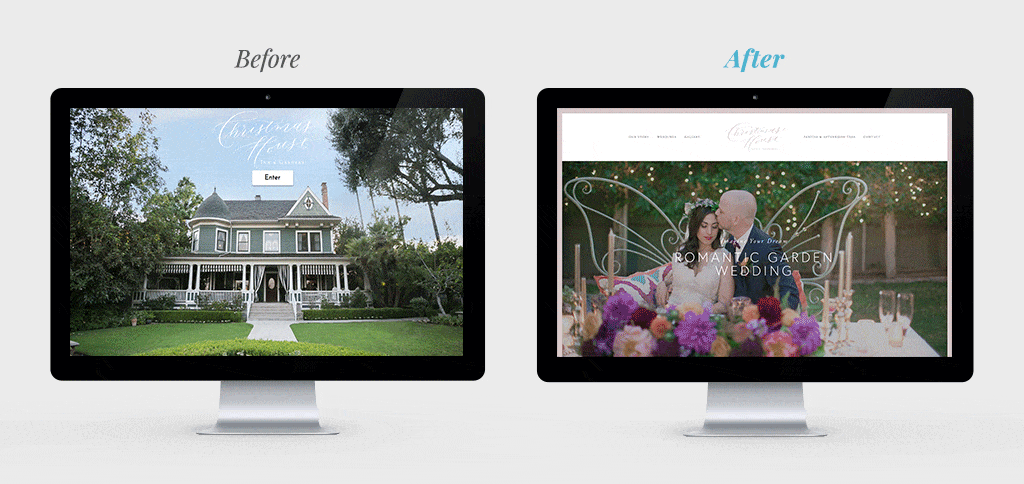
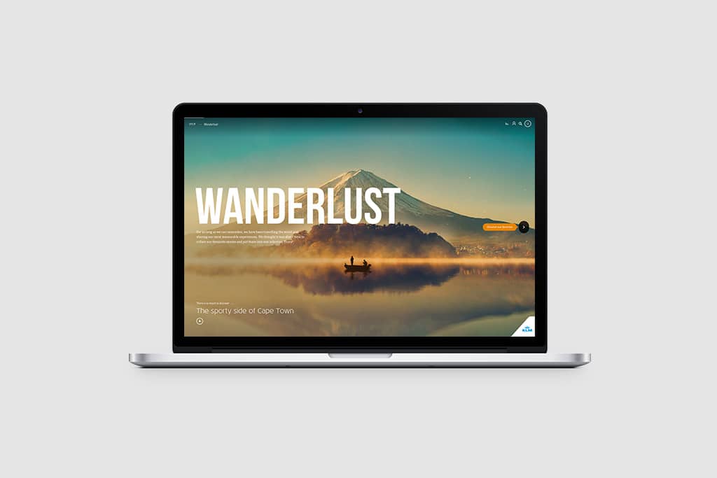
Diverse, useful content is at the heart of Visit Philadelphia’s marketing strategy. They focus on what people are searching for and respond with engaging articles, maps, listicles, and more. Their goal is to serve as a resource for anyone looking to plan a trip to Philly. Since they invest heavily in their content, they also want to make sure they get the most bang for their buck. So, they come up with creative ways to repurpose the content across channels while carefully measuring reader engagement and feedback.

Takeaway for Hotel and Destination Marketers

Dig into what kind of information your prospective guests are craving via tools like Google Trends and SEMrush (or, even better work with a destination marketing agency that will do the heavy lifting for you). Then, deliver it to your audience in a variety of easy-to-consume formats.

Best Website: Visit Idaho

Visit Idaho Destination Marketing
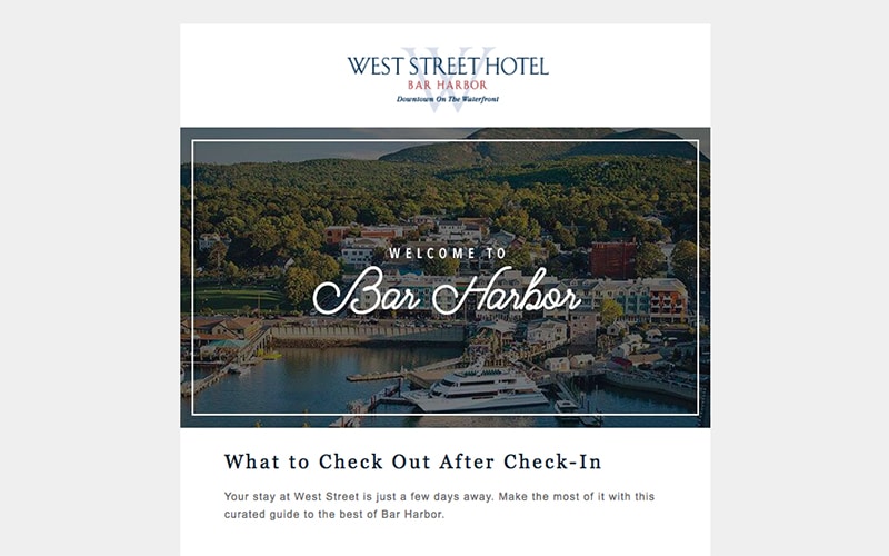
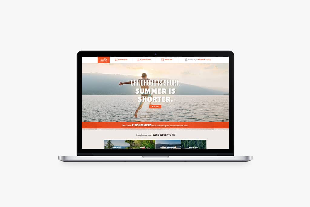
While Idaho may not come to mind when you think of family vacations, Visit Idaho is aiming to change that. The clear and iconic navigation makes finding what you want easy with menu items like “Things to Do,” “Places to Stay,” “Travel Tips,” and a “Regional Map.” Each adventure page (like this one for Lava Hot Springs) has everything you need, including the current weather. The coolest part about Visit Idaho’s website may be the “Backpack” feature, which lets users add adventures and tips to their personal “backpack” to revisit later.

Takeaway for Hotel and Destination Marketers

Design your website around the things that people are looking for. Then, deliver so much value that they see your site as the go-to resource on their trip, even if they’re not immediately planning to visit.

Best Print Publication: San Diego Magazine

San Diego Destination MarketingSan Diego Magazine combines attention-stealing photos with compelling content. With wit and creativity, they deliver a publication that’s as entertaining as it is informative. While the over 35 million tourists “California’s Beach City” attracts every year may expect a standard travel guide, San Diego Magazine exceeds those expectations.

Takeaway for Hotel and Destination Marketers

For hotel marketers, print is a fantastic option as custom magazines can engage readers at the perfect place and time – during their stay, when they’re looking for things to do. DMOs should consider taking another look at their tourism and travel guides to make sure they’re as creative and compelling as possible. Print should be a key component of any strong hotel or destination marketing strategy.

The 5 Jobs Your Wedding Brochure Should Be Doing for You

You may have your prospective brides and couples at your property for an afternoon, but the moment they walk out the door from that site visit, it’s up to your follow-ups and your wedding brochure’s metaphorical hands to get the job done and convince the couple to book your venue. Whether you produce one on your own or with us through our free, ad-supported wedding brochure model, here are the five jobs a good wedding brochure will do for you:

1. Make Your Case All Over Again to the Friends and Family Who Weren’t There

Wedding planning is inherently social. We talk to our friends and family and bounce ideas around regarding the guest list, color scheme, food and beverage, and perhaps most importantly, the venue choice. The wedding brochure can serve as a talking piece and a focus for the couple’s conversations with others – both those who may have attended and also those who didn’t. When the bride describes this perfect spot that she’s thinking about saying “I do” at, she’ll be able to tangibly hold it in her hands, pass it to a friend or parents, and bring it alive more fully by pairing her description with your visuals.

2. Keep the Anticipation and Excitement of Hosting at Your Venue Top of Mind

Couples will likely visit at least a few other properties, and all those spaces can blend together in their heads. Your wedding brochure reminds the bride of the things she liked best – from a beautiful photo of a certain space she might’ve loved during the visit to a specific part of your process for working together, which you can communicate in a text section. It’s sort of like when you have a vacation booked, and you visit the same websites over and over and let the anticipation and excitement build – your event brochure can be the focal point for the bride’s excitement about this huge day (and investment) at your venue.

3. Be There to Provide the Details They Need to Know

There are questions that you answer in your first conversation with a prospective client, questions you answer during a site visit, and questions you answer after, during the decision-making process. By addressing all these in your event brochure and including other important information like floor plans and menus (if applicable), you’re removing some of the uncertainty that lurks during an important decision-making process like this. By the end, the brochure should be dog-eared and worn, having acted as a trusted, frequently consulted ally. As a bonus, you’re also able to lessen the work your sales team must do to close a sale. By giving brides what they ask about most often, you reduce the time that your team needs to spend responding to those common questions.

4. Offer a Blueprint for the Rest of the Event

The event brochure can also be a gateway to unlocking the other aspects of an event by acting as a directory of sorts – not to every vendor in the business, but to a group of preferred vendors that you feel comfortable recommending, have confidence in, and can speak to their merits. You’re doing the couples a service by providing this information, and, when you work with Hawthorn, you could pay for the brochure in its entirety by including vendor listings. Strong relationships with vendors – solidified with listings in the brochure – help the couples, pay for the brochure, and ensure seamless events.

5. It Keeps Your Sales Team’s Foot in the Door

The brochure gives your sales team an easy follow-up conversation starter. “Remember when you saw the ballroom, pictured on the fourth page of the brochure? We have new lighting options…” For clients who choose to work with us, the ePub comes into play here, too. It makes the brochure even easier to reference and share.

Before and After: 3 Client Websites We Transformed

From a photographer to a wedding planner to an events venue, these clients needed a new website design that yes, looked good, but also drove business.

Websites are your doorway to new business. A thoughtfully designed, purpose-driven website makes all the difference. Up until recently, websites of this caliber were only available to businesses with big budgets and six-plus months to invest in the project.

Now, utilizing Squarespace’s infrastructure, a marketing agency like Hawthorn can focus on nailing the design, navigation, and content of a website, and get the job done on a smaller budget and shorter timeline than previously thought possible. The difference is that Squarespace essentially allows us to remove the need for a web developer by making the interface designer-friendly. It still took a solid number of months for our designers to ramp up in full with the help of our director of technology (who stays involved to build the navigation and UX), but the end result is a process that reduces complexity and cost, and lets us focus on designing a strong site that drives engagement and action.

Here, we spoke with Hawthorn’s Creative Manager Kristen Ritzenthaler to help us pick apart three recently completed website design projects – what was wrong before, how we addressed it, and why their business is better for it moving forward – in a “before and after” review.

The Professional Photographer

Photographer Amy Wellencamp’s website made visitors do too much work to find what they were looking for.

Main Goal: Make the information that people are seeking easier to find.

How We Did It: We focused on re-thinking and prioritizing the navigation on every page and designed around Amy’s three main customer “buckets.”

Kristen’s Take: “There was no cohesive story to Amy’s former website. The small images weren’t doing a good enough job showing off the amazing work she does. The site’s navigation wasn’t effective in getting people to where they needed to be. The menu was buried, and there was no way to scroll down and explore. We knew we had to address all that.

“For someone whose business is about her unique sense of taste, we knew it would be especially important to nail her aesthetic, so we started by putting together a mood board with a color palette, fonts, graphic inspiration, and more – and she raved about it. She has three big buckets of clients – senior portraits, weddings, and family shoots – so we positioned the website to showcase each of those things and gave each of them a landing page.

“In the end, it was about showcasing her already-amazing photos and letting the work speak for itself.”

The Event Planner

Ana Stefanovich of North Shore Weddings by Ana had a dated website that just didn’t do her work justice.

Main Goal: Modernize the website’s design and build around tasteful images that show off the quality of her work.

How We Did It: We scrapped the textured background and refreshed the typography, colors, and navigation.

Kristen’s Take: “In a business as visual as event planning, our primary concern was that the images didn’t grab you. When she submitted all the new photos to us, we knew we could work with them – they were all Pinterest-worthy, Instagram-gold-level amazing. Truthfully, we were almost surprised, because her old site didn’t reflect this caliber of work. It was important to us to show all the looks she can pull off: classic estate weddings, rustic weddings, tent weddings. With the old site, you couldn’t really tell what her style was, because there were just one or two photos of each wedding. On the new site, we set up a gallery for each featured wedding so that visitors can go deeper and really explore her work.”

An Events Venue

Christmas House Inn & Gardens, a historic venue southeast of Los Angeles, had a website that was re-done just last year, but there was one problem: it didn’t have a homepage.

Main Goal: Give the website a proper homepage and a design that’s true to them.

How We Did It: We dug into the ins and outs of their business – who their customers are, how they see The Christmas House, and what the biggest revenue drivers are – and designed using their already-built brand guide.

Kristen’s Take: “Their current site, which was done last year, doesn’t look bad: There’s white space, no hideous fonts, and good images. The clunkiest thing about it was that it didn’t have a good homepage. The homepage is the weddings page. As a visitor, you had very little idea who they are or what they do.

“One of the venue’s main challenges is its name, The Christmas House. Naturally, people assume the venue has a strong link with the holiday, but the name is simply a carryover from the business’s beginnings more than a century ago. So, understanding that struggle, we wanted to reimagine the brand, and what we learned is that they already have a beautiful brand guide with elements, fonts, hand-script lettering – but none of it was incorporated into the site. It baffled us. So, in the redesign, we used those elements and made them a big part of the site.

“Finally, we tried to spotlight the key revenue drivers and make exploring the site a more immersive experience for visitors. It wasn’t all about visuals, either – we wrote all the copy and built it around an SEO keyword package.

Luxury Hotel Marketing Tactics to Target Three Key Guest Types

Every luxury hotel knows these three guest archetypes and wants to engage and appeal to them. Here, we share the top luxury hotel marketing tactics for reaching them at the top of the funnel.

The “dreaming” stage of the traveler’s journey is when the traveler is thinking about taking a trip without a particular destination or timeframe in mind. This stage is at the top of the funnel and particularly valuable in luxury hotel marketing. Capture their attention with some stunning photos and your potential guest may just skip the other steps and fly right to your booking engine.

We’ve zeroed on how to market to travelers during the dreaming phase by starting with three common luxury hotel guest personas. Then, we present a sample tactic for paid, earned, and owned media outlets. The result is a quick cross-section of some of the tactics you want to make sure you have nailed down.

1. The Lacrosse Mom

The Lacrosse Mom is an upper-middle-class, trend-following leader in her family. She wants a vacation that’ll be fun and engaging for the kids, but still interesting enough for her and her partner.

Marketing Tactics to Optimize

  • Paid – Influencer Marketing: If influencer marketing brings to mind millennials and Generation Z – you’ve got it all wrong. The LM lives for scrolling Pinterest and swiping through Instagram. There are tastemakers – like these “Influencer Moms” – in their 30s and 40s with large followings who are a perfect partner for reaching the LM.
  • Earned – Online reviews: Make sure your presence is updated on TripAdvisor, Yelp, Expedia, and the like, and constantly scan for new reviews. The LM wants to know that she’s not just going on any old vacation – she did her homework and is staying at a resort with “amazing reviews.” Address any negative reviews promptly and effectively, and promote the glowing ones on your social channels.
  • Owned – Email Marketing: Because she likely booked the trip and is the contact between your hotel and her family, the LM’s email address is very valuable. Build and maintain segmented email lists of guests who stay with you to encourage them to return at strategic times.

2. The Jet-Setting Baby Boomer

Whether retirement has hit or not, the Jet-Setting Baby Boomer (JSBB) has a good sense of what he’d like to do on his getaway and will conduct careful research. He appreciates a good deal, but he’s willing to splurge for bucket list–type activities and luxurious accommodations.

Marketing Tactics to Optimize

  • Paid – Pay Per Click: The JSBB’s research will largely take place on Google and considering his willingness to click search ads a strong PPC campaign is a key ingredient for capturing the JSBB’s attention.
  • Earned – PR: Legacy publications are still a trusted source of information for the JSBB – think magazines, both national and regional. Maintain a good relationship with journalists and publications. You can help them by being a source, for example. You never know when they could feature you in their next story.
  • Owned – Content Marketing: Going hand in hand with the aforementioned SEM strategy, building and maintaining a robust content strategy is key. The obvious place for you to produce your own content is on a blog, but it can also be elsewhere on your website. Having a trove of informative, interesting stories will keep the JSBB on your site for longer, increasing your chance of conversion.

3. The Rising Corporate Star

The Rising Corporate Star (RCS) does everything fast, from her morning routine to climbing the corporate ladder to booking vacations. She’s not the corporate warrior of old – this 30- or 40-something values her time away from the office. She doesn’t need to meticulously review her options, she doesn’t need to penny pinch, and she doesn’t hem and haw: She pulls the trigger when met with an offer that’s sufficiently easy and attractive.

Marketing Tactics to Optimize

  • Paid – Retargeting: Get your message in front of the RCS enough times and her impulsivity could take over – especially if she’s already visited your website.
  • Earned – Social Mentions: If the RCS has a vacation in the back of her mind and she sees a friend mention something regarding her own fabulous stay, it could be just the nudge she needs to book. Give your guests a reason, like gorgeous visuals, to follow you on social media.
  • Owned – Mobile Website: As we established above, time is precious to the RCS. Those few minutes of downtime on a commute could be when your luxury hotel catches her eye. If your website isn’t optimized for mobile and she’s browsing on her phone, she’ll bounce to the next option. Be prepared.

Project Profile: Lansdowne Resort & Spa In-Room Newsletter

Digital marketing may get all the attention, but the satisfaction of flipping through a captivating in-room newsletter, magazine, or guide is here to stay. Your hotel guests may seem like a captive audience, but you should never stop delighting them. After all, that’s how one-time visitors become lifelong customers.

The Client

Lansdowne Resort & Spa is located riverside in Leesburg, Virginia, in the heart of the state’s growing wine country. The 296-room, AAA Four Diamond resort is a destination in itself, with a 45-hole golf course, a spa, and four on-property restaurants. Guests range from families and couples of all ages to a variety of corporate groups.

The Project

Lansdowne understands how valuable the in-room newsletter or compendium can be. After all, in-room collateral is a prime example of right-place, right-time marketing. But if it’s tired or boring, guests will not engage with it or appreciate it. We worked with Landsdowne to develop a solution that was informative as well as exciting and aspirational.The Good Life newsletter is filled with key resort info intermixed with inspiring stories. Topics range from seasonal activities to unique spa treatments to the resort’s pioneering garden program with a local nonprofit. Our content team worked hand in hand with the resort team to build a structure that’s easy (and affordable) to update every two months. Our design team made it equally beautiful and scannable, just like we do with all of our in-room custom magazines. Lansdowne connected with a local printer to print the first edition and the project took off.

Our Take

If you glance through our suite of services, you won’t find anything quite like this in-room newsletter. We listened to the client’s objectives and provided a custom product by using our in-house content marketing and design staff. Hawthorn has the unique ability to combine design, web, and content talent to produce products that meet a full spectrum of client needs. Plus, we love thinking outside the box to find the solution that’s a perfect fit!

Last Thought

When you think “content,” you may think story writing, but our content team’s capabilities and duties go beyond that. Our content must always: engage the reader, look its best, and be easily (and cost-effectively) replicable. Once the original publication and format are in place, it’s easy – and affordable – to produce new editions by swapping out sections and modifying little elements.

3 Superpowers the Right Website Can Give Your Small Business

In the hospitality industry, where putting your best (visual) foot forward is vital, small businesses would be remiss to think of their websites too simply.

As a small business in the hospitality industry, your website is the sun that your digital presence revolves around. Think about it: your email signature, your social media presence, your email campaigns – they all aim to funnel customers back to your website so it can act as the closer and finish the job. So don’t just think of your website as an online brochure. Here are three “superpowers” your website and website design can deliver if done right.

An Always-Open, Always-Humming Sales Machine

“Always be closing” is the famous mantra preached to salesmen in Glengarry Glen Ross, and it applies just as much to small business hospitality websites. If you’re re-thinking your website, the primary goal shouldn’t be to make it look pretty, but to turn it into a machine to drive sales, often by generating leads. Whether someone visits your website at 3 a.m. or 3 p.m., on mobile or desktop, with time to browse or just passing through, it should deliver your message quickly and effectively and work to move the visitor through the pages to the place you want them to go most – presumably where they fill out a form, send an email, or add an item to their shopping cart.

When you have the right website, it gives you peace of mind knowing that it’s almost like a perfectly trained salesperson, always working on your behalf, generating leads and drumming up business. A poor website, on the other hand, can fumble away a sale you almost had. If a prospect heard good things about your business via word of mouth and wanted to check you out online, but found your messaging lacking, they may move on to someone else.

A Bigger, Better Billboard Than Your Competitors’

Imagine a busy bride-to-be. Her eyes are practically glazing over because she’s looking through so many wedding vendor websites. It’s often hard to tell photographers apart – but it’s easy to toss them into the “no” pile. In fact, she’s looking for reasons to say no. Dated fonts or structure? Pass. Difficult-to-decipher value proposition? Pass. Not mobile optimized? Pass. Blurry photos? Instant pass.

It’s not that these websites are offensive looking or terribly ugly – the main crime is usually blandness or lack of clarity. So when our aforementioned bride does come across a photographer’s website that’s well structured, communicates the value proposition clearly (and quickly!), shows off high-resolution images, and has a clear next step in the form of a CTA, she’s dramatically more likely to engage with it. Your website should add to your business’s credibility – not take away from it. It’s especially true if you’re in a visual business – and who isn’t, in hospitality? Whether you’re a restaurant, a hotel, a catering facility, or a florist, showing off your spaces or your product has to be job number one. Think of those warm prospects who stumble upon your site and poke around for a few seconds. Are you really putting your best foot forward, or are you losing business that should be yours?

Total Independence and Control

Some small businesses leave their main digital presence to a third party’s platform – it’s the restaurant that only has a Facebook Page, or a wedding vendor who lives solely on Wedding Wire or The Knot. The problem with that is that you’re putting your eggs into someone else’s basket. When you have your own website, on the other hand, you control every pixel of the experience and are constantly guiding readers toward contacting you in that form. If you rely on another’s platform, you’re subject to the whims and motivations of their company. In the case of Facebook, their goal isn’t to support your business; it’s to keep people on Facebook.com as long as possible to maximize ad revenue. You can and should have a robust Facebook page, but the objective should be to get people back to your website – a permanent online home perfectly fit to execute your business’s objectives.

It’s the difference between renting a kiosk at the mall and having your own immersive retail space. At a kiosk, other stores are within view, trying to catch your customers’ wandering eyes. There are distractions. Plus, really, there’s only so much you can do to customize a kiosk. Rent the retail space instead. Invest in your own website.

5 Marketing Steps for Wedding Venues to Be Ready for Engagement Season

The Wedding Wire estimates 40 percent of couples get engaged between November and February, with the bulk occurring between Christmas and Valentine’s Day. And for wedding venue marketers who know the venue decision is the first newly engaged couples make, this means cramming your window of opportunity into an even narrower slot. No pressure. So consider this your to-do list to get your house in order. Here, we outline a few ways you can be ready for the onslaught of traffic and inbound interest and convert as many couples into happy customers as possible.

Remember that Mobile-Friendly Is Couple-Friendly

For many young, newly engaged couples, a computer is something they use at work. They may have a laptop or desktop at home, but for most, the smartphone is where they do their web browsing. For that reason, it’s crucial that your website looks as good on mobile as it does on desktop. If it doesn’t render right, you’re not even in the ball game, let alone in contention. If you’re not sure whether your site is mobile-friendly, it’s easy to check: just take out your phone and go to your website. Is it easy to read? Can you easily see all the important stuff without zooming in? If so, you’re probably all set. If not, it’s important to address it as soon as possible.

Get New Staff Up to Speed

Your staff is only as good as the information you arm them with, so make sure they’re equipped to represent your venue well and hit all its unique selling points when talking to customers. If you have new staff, it’s doubly important to check if they’re well-versed with the venue’s details and are able to fluently answer questions. It may be tough to book a couple, but it’s easy to lose them, and there’s perhaps no easier way to do so than by responding to an inquiry in an underwhelming way. Give your staff the tools to succeed.

Update Your Marketing Collateral

In addition to updating it with your latest contact information and current offerings, aesthetically speaking, the right brand collateral looks as good as the venue itself. And there’s perhaps no better time of year to update it than just before the rush of engagement season. Brand collateral can spark a thought after a site visit, and it’s a chance to leave the customer with something to look at and hold as they consider your venue. Make sure it leaves an impression worthy of your venue.

Establish A Finely Tuned Follow-Up Machine

Whether it’s software like Pipedrive, a shared spreadsheet, or a series of sticky notes on a communal whiteboard, you and your team need a system to methodically track and follow up with leads and outbound communication. If you have one, great! Too often we hear from clients whose site visit inquiry and follow-up system is scattered and haphazard. With your team, define the right frequency and timing of follow-ups as well as any core messaging or links to include, such as the digital version of your Hawthorn event brochure if you produce one with us.

Mind Your Site-Visit CTA (Call to Action)

Imagine you’re a new bride or groom to be. You’re perusing dozens of venue websites, trying to determine the perfect spot for your big day. Will you spend time poring through each page of every website? Of course not. In fact, you’ll look for reasons – subconsciously or otherwise – to simply “x” out and move on to the next one. Venues without a CTA – in other words, an obvious “next step” toward making a site-visit inquiry – are often thrown into that bucket of “no’s.” An effective wedding venue website doesn’t necessarily try to close visitors on a site visit right off the bat – it may walk them through information and graphics in a cleanly presented, engaging way before leading them to the form or “contact us” button. Just like if you were talking with a prospect in person, you’d make the person feel comfortable, answer questions, but also have a clear next step during every stage so things move along.

How to Get Brides’ Eyes on Your E-brochure

Every client who produces an event brochure with Hawthorn also receives a digital E-brochure as a part of the package. But how powerful the digital marketing tool is depends on how you use it.

When you work with Hawthorn to develop an event brochure, you get a beautiful, well-crafted publication that brides and grooms can take with them at the end of a site visit. In addition, every event brochure client also gets that publication in E-pub format, allowing you to engage with couples digitally. Some of our clients have let the E-brochure get lost in a dusty corner, while others have used it as the cornerstone for their digital marketing efforts – on their websites, in their email correspondence with couples, and in their social media postings. Here, we go a step further than these core distribution channels to highlight the particular tactics and ways you can best put your Hawthorn E-brochure to use.

Skip the Text Link and Share the E-pub as a Clickable Image on Your Website

It sounds basic, but don’t forget to include the link on a relevant page on your website, and provide enough context so that the visitor understands what they’re clicking and why it’s valuable. A text link is okay, but a more prominent, clickable image is what we recommend. We provide each client with a thumbnail image of the cover of the E-brochure; otherwise, you could Photoshop a good venue image with some text over it (ex: “Check out our wedding brochure”) to more effectively entice visitors to click. Time and time again, clients tell us that image links like this convert better than a simple text link to the E-pub.

Your Email Signature Is Ad Space – Use It

Our email signatures can serve up what are essentially ad impressions to recipients. If your position is solely focused on wedding and corporate event business for your organization, the E-publication is a great, helpful link to include in your signature. In this instance, we recommend using the thumbnail of the cover image that we provide to each client.

Broadcast Your E-pub Semi-Regularly on Social Media

The social media strategy for your venue is primarily geared toward inspiring future brides and grooms, but posting the E-brochure from time to time can also make it informative (in addition to inspiring). A link to the E-brochure is a pretty package to capture that casual interest on social media and convert it into a site visit. But you may be asking, “you expect us to post the same link with the same image multiple times?” No, we’d never suggest that. Check out below…

Tease to Specific Pages within the E-brochure

There’s a simple way for you to get unique urls for each page within your E-brochure. This functionality then translates into potential uses across all your distribution outlets: share different spreads from the E-brochure as a part of your social media postings; highlight various aspects of your event spaces in email campaigns or personal emails correspondence with couples; make clickable images on your website to different sections of the E-brochure (ex: floor plans if your website doesn’t have a page where that’s naturally presented).

Share Passages of the E-brochure Natively to Social Media

To share a part of the E-pub natively to social (i.e. an image will show up in followers’ Facebook or LinkedIn or Instagram feeds, rather than just a link to the brochure), as you’re not sure they’re going to click the link, just screenshot whatever passage or image you want to highlight, and then link to the full E-pub in the post. Visitors will value the ability to consume the content right in-feed, and you may catch the eyes of some who would otherwise just scroll past a regular link.

3 Free Apps to Give Smartphone Photos a Professional Finish

Calling all hospitality marketers: These three apps are a godsend! If you’re looking to add a little polish to your smartphone photos, check these out.

Social media is decidedly a visual medium. Feeds are filled with photos of glistening pools, shamrock green grass, and other wanderlust-inducing shots. You want to do these gorgeous real-life scenes justice, but you don’t have the funds to hire a professional. Here, we outline three apps to keep in mind the next time you’re out on the property and and snapping some pics. They will give your photos a look that may just be scroll-stopping.

Google Snapseed

Google Snapseed flies under the radar, but gives users a surprisingly wide range of features. Lens blur effects, editing in landscape mode, color- and white-balance adjustment, and much more are available. While other apps have their filters mixed together, Snapseed organizes its filters by category, like “Glamor Glow,” “Vintage,” and “HDR Scape,” cutting down on the time required to give your photos the feel you’re looking for.

Best for Hospitality Marketers When:

You don’t have much time to edit but want to tweak and post that photo ASAP because your space looks perfect.
iOS Download / Android Download

Adobe Photoshop Fix

Adobe Photoshop Fix carries with it the brand equity Adobe has built up with creatives. This simple app lives up to those high standards. Its strength lies in its ability to retouch faces using features like the Heal and Patch tools. You’re able to tap the blemish or object you’d like to remove, and the pixels will intelligently blend in with the rest of the image. The Liquify feature, a user favorite, enables the goofy reshaping of faces, and can even turn a frown into a smile. Anyone who’s taken a group shot knows how tough it is execute well – this app helps take a little bit of the pressure off.

Best for Hospitality Marketers When:

You’re touching up a photo that predominantly features faces and want to make sure everyone looks their best.
iOS Download / Android Download

VSCO

VSCO is actually a social app, in addition to its role as a photo editor. Think of it as Instagram for photographers and the creative set. Because VSCO serves that crowd, the app’s photo editor has some powerful tools and lets you give your hospitality marketing images a tastefully artistic look. There are plenty of preset filters if you only have a few seconds to make the photo look good before sharing, but VSCO’s real power is its ability to configure manual settings like the exposure and focal point of the app’s camera, split tinting of highlights, and even control over perspective. It’s not a replacement for Photoshop, but it can substitute in a pinch.

Best for Hospitality Marketers If:

You have a vision and a bit of time, VSCO can basically get your photo looking exactly as you want it, down to the pixel, for use in your hospitality marketing materials.

iOS Download / Android Download

Project Profile: Benchmark Digital Meetings Guides

Have a need to drive more corporate groups to your hotel or venue? So did Benchmark. We brought their meeting offerings to life with content marketing.

Hotel Room Basking in the Sun near the ocean - showcasing imagery for proper hotel marketing

Benchmark Hospitality, a Hawthorn client since 2011, manages 41 resorts and hotels that span the globe. Our relationship with them started with Mosaic, an annual in-room magazine full of stories about Benchmark destinations. A couple of years ago, happy with the results of Mosaic, Benchmark expanded their digital marketing efforts with us by tapping our content marketing team to create online guides for each of their hotels. These “Wanderlust Guides” (see an example) give leisure guests a full lay of the land of the hotel and destination through four pieces of content, such as “Flavor Of” (can’t-miss food and drink spots) and “The Weekender” (how to spend 36 hours in the destination), and were a key component of the campaign that landed Benchmark the 2017 INDIE Award for “Best Digital Marketing Campaign.” But corporate groups have long been a central part of their business, so that became the next frontier for our content marketing work with this client.

The Project

Benchmark came to us and said that they wanted “Wanderlust, but for meetings” for each of their properties. While the Wanderlust Guides content is a little more angled, the new meetings guides were to be more informational and straightforward, yet still employing the same editorial reporting and writing skills we use in all of our content marketing projects. Each Meetings Guide has five sections: Team-building (activities offered through the resort or with local businesses, like escape rooms), Culinary (mixology classes to menus), Off-site (local venues great for groups), Amenities (the most novel on-site offerings from an on-property water park to private demo kitchen), and Themed Events (top ideas from the hotel planners for corporate planners to consider.) When looked at collectively, these sections of their hotel’s websites now bring to life their meetings offerings in a way that only an in-person meeting with a client could previously deliver, plus the added benefit of digital data and distribution power.

Our Take

Talking to leisure travelers via content marketing is something we’ve done for many clients (including Benchmark) – here, we took that approach to address a common pain point for hotels: “how do I bring more corporate groups?” Content marketing doesn’t have to be just for the leisure traveler. With a foundational content marketing strategy like Benchmark’s meetings guides, they’re able to drive attention via their social media and email marketing efforts and more effectively convert leads into customers.

Last Thought

At its core, content marketing follows a similar formula: match a client’s marketing goals with what is most interesting and engaging to the primary audience so it’s something they can authentically value. But done right, no two content marketing strategies will look the same. They may have the same broad objective (ex: “drive repeat leisure guests,” “reach top-of-funnel corporate event planners”), but the end solution, and what we call “content marketing ecosystem,” will always be driven by your unique needs. So in this case, developing a content marketing solution that would drive more corporate groups and meetings business may look very different than what we built for Benchmark.

The Rise of Illustrations in Hospitality Marketing

Whether you’re marketing a hotel, destination, or event venue, photos drive your creative. It’s why our wedding and event brochures and destination blog websites like this one are filled with beautiful, color-drenched images. Inspirational imagery can drive travelers to book their vacation on the spot or couples to book their site visit tomorrow. But that doesn’t mean we’re not fans of the rise of illustrations in hospitality marketing materials of all kinds, both print and digital.

Simply put, illustrations are different. They can reveal more brand personality, creativity, and style than photos. There are many opportunities for illustration and iconography to slice through consumers’ haze and paint a fresh, new picture of your brand. Here, we discuss what’s compelling about illustrations, where they work best, and some tips on how to hire an illustrator.

Why Illustrations Are Working

Illustrations can provide a level of uniqueness that helps you stand out. While photos show a scene in clear detail, they are constrained by what’s in any single frame. Illustrations, on the other hand, are only limited by the artist’s abilities, and can convey a brand image or ideas more effectively. When done really well, they can resonate long after a great photo has been absorbed.

That’s not to say that they’re the right choice for everyone, though…

When Illustrations Work Best

Illustration isn’t appropriate for every brand or marketing opportunity. Bigstock Blog did a good job breaking down when you should steer toward photos, and when you should consider illustration:

Are you selling a specific product?

Use a photo to display it clearly.

Are you selling something intangible?

Try an illustration to capture a theme or experience.

What is the age range of your target audience?

Younger people may be more receptive to the whimsy of a fun illustration. An older audience may prefer the trustworthy vibe of a photo.

Is your business an underdog, compared to the market leaders?

Try an illustrated style to shake things up and set your brand apart.

Examples of Illustrations in Hospitality Marketing

Hawthorn’s work on The Woodstock Inn & Resort’s magazine shows off mixed media, with illustration annotating a photograph. These graphics give readers the honesty of a photo with the light-heartedness of a sketch. This vibe fit perfectly with the story inside.

Illustrations in Hospitality Marketing Example - Flatbread

Flatbread, a small chain of pizzerias in New England (and a go-to favorite of Hawthorn Creative), uses a plethora of illustrations throughout their website and branding to reflect a handcrafted feel. This isn’t something that would be appropriate for a national brand like Domino’s, but for an artsy upstart – perhaps a boutique hotel or edgy venue – it hits the mark perfectly.

Illustrations in Hospitality Marketing Example - Leaf & Land

It may seem counter-intuitive for a wedding photography business to lean on illustration for their logo, but it works quite nicely for Leaf & Land. Couples look through countless photographer websites, trying to discern who would do the best job capturing their wedding. Leaf & Land’s aesthetic sensibilities immediately shine through and give you a sense of their artsiness and bohemian taste.

How to Hire an Illustrator

If you think that illustration work may be right for your marketing, but you’re not sure where to start, one place to turn is Upwork. The backgrounds, skill levels, and prices vary dramatically, so there are options for budgets and needs of all kinds. If you’d prefer to look through portfolios first and then find the artist second, browse the designs at Dribbble, then contact the illustrator who feels like the right fit. If you’d rather not screen through hundreds of options, you can hire a design-forward agency like us to take you through the creative process and produce exactly what you need.

Feeling Inspired? Let’s Talk